Ribbons
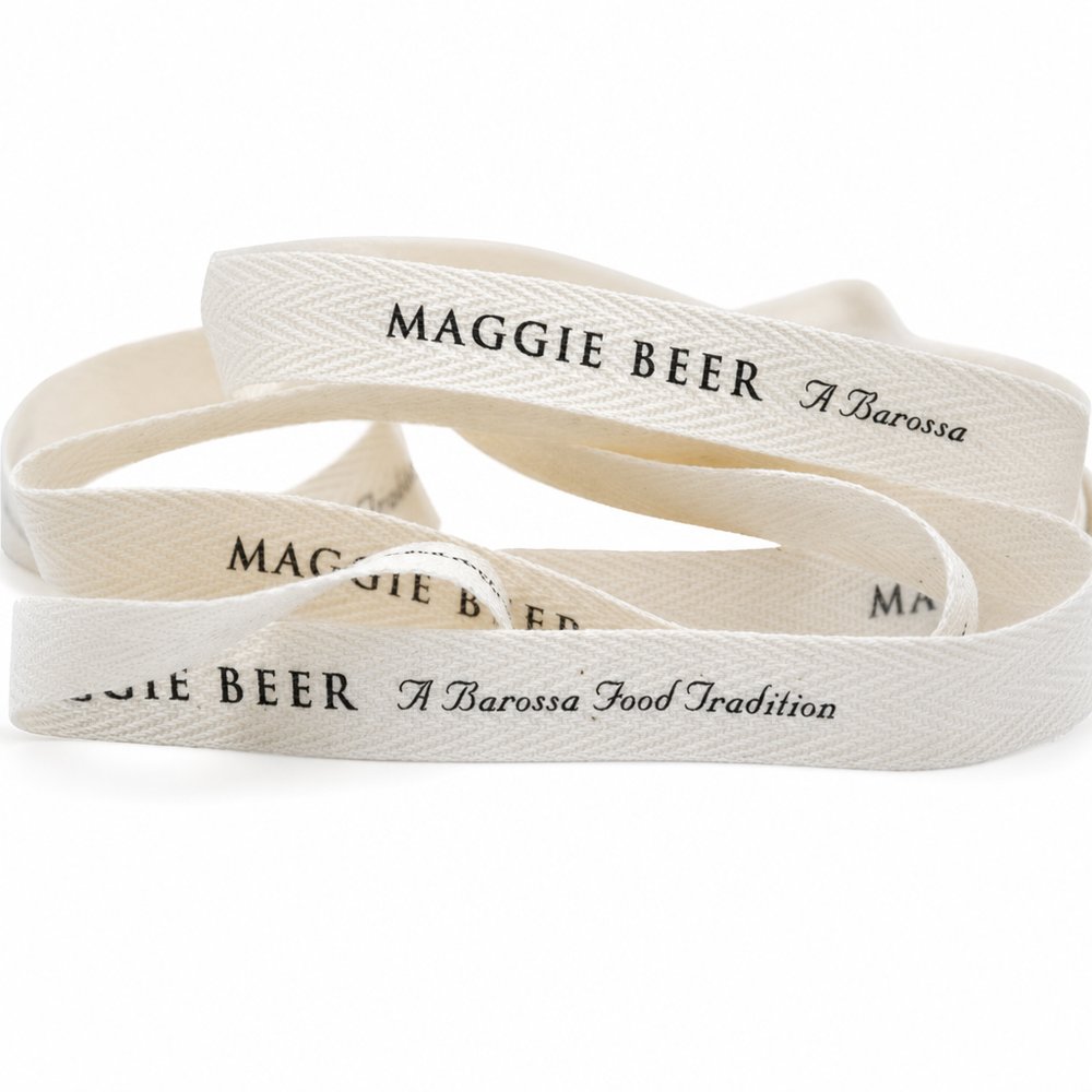
Custom Printed Cotton & Herringbone Ribbon
From US$1.38 ex taxMOQ 500
find it. love it. keep it.
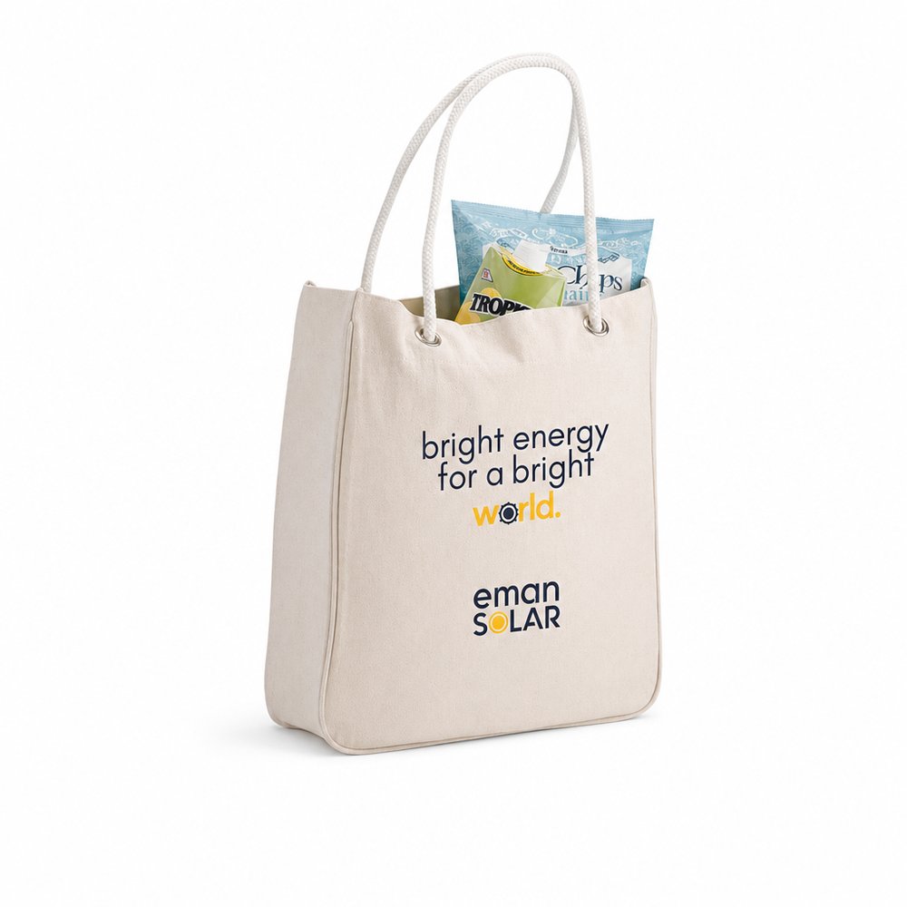
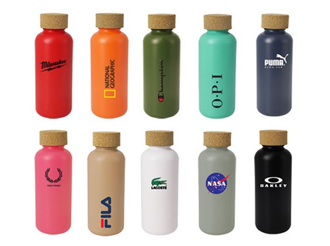
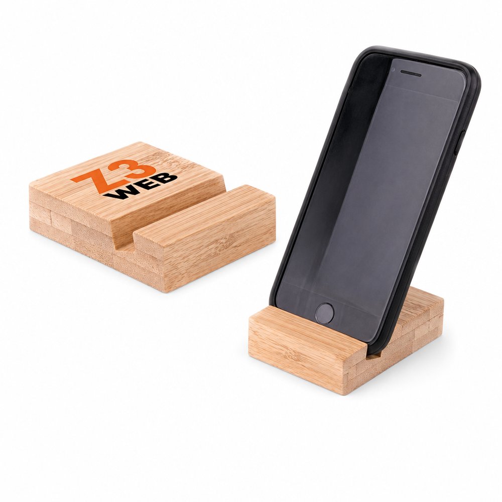
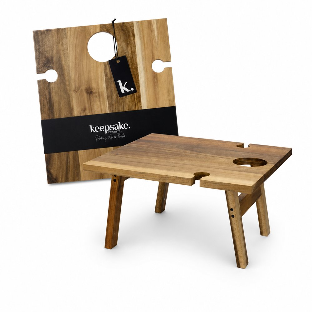
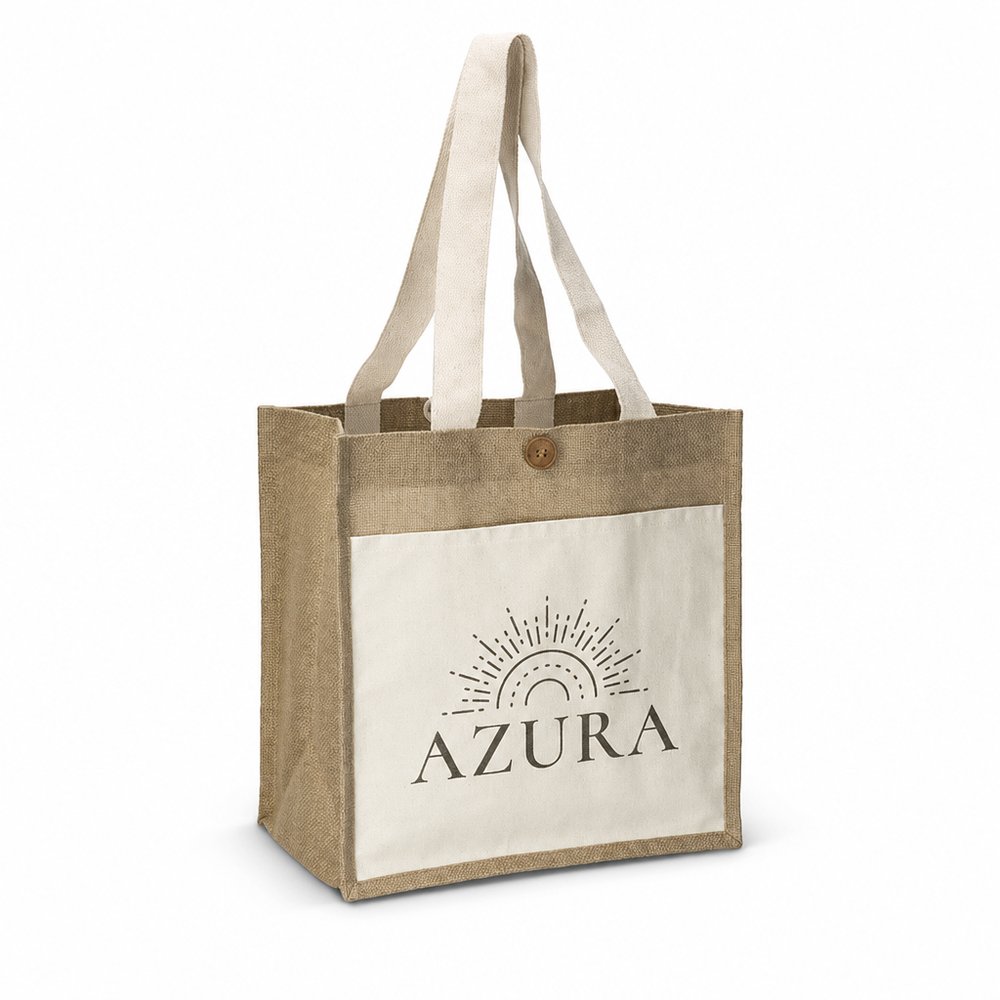
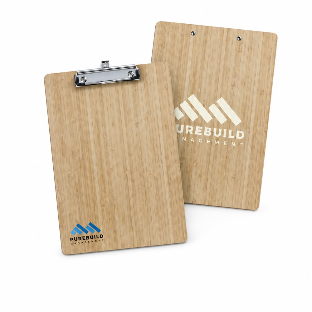
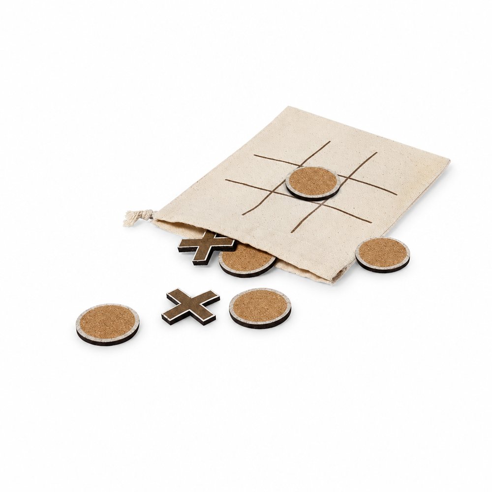
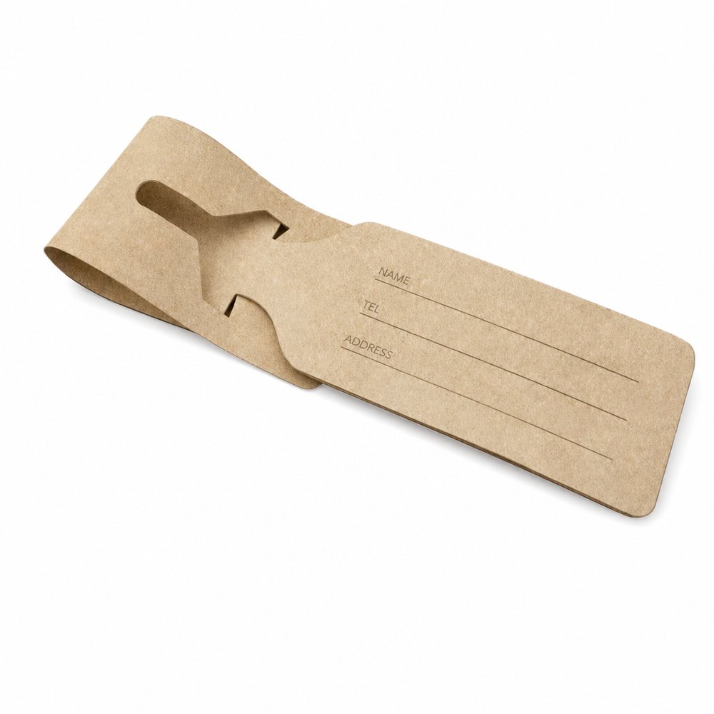
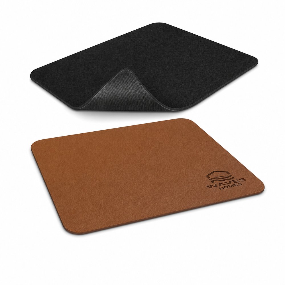
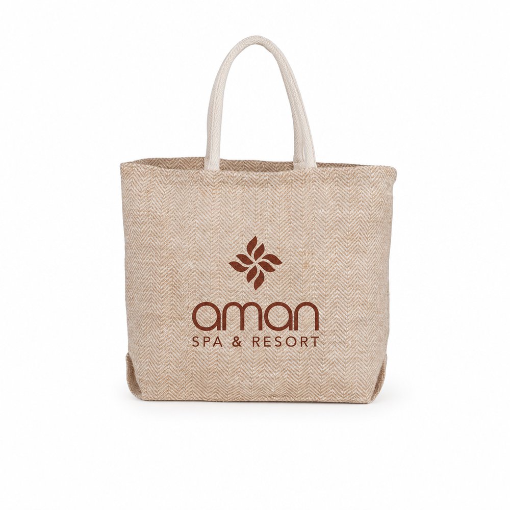
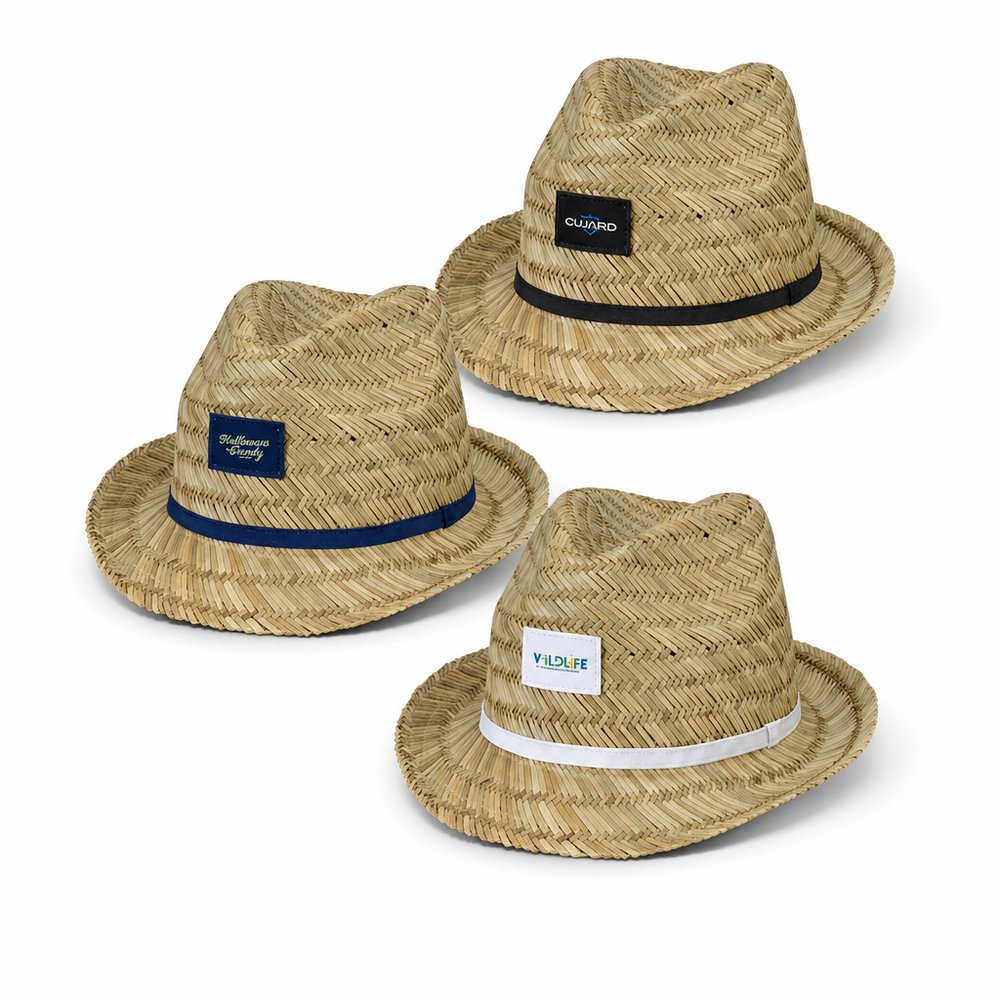
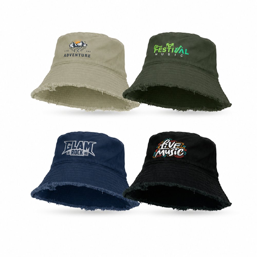
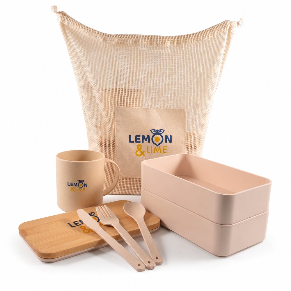
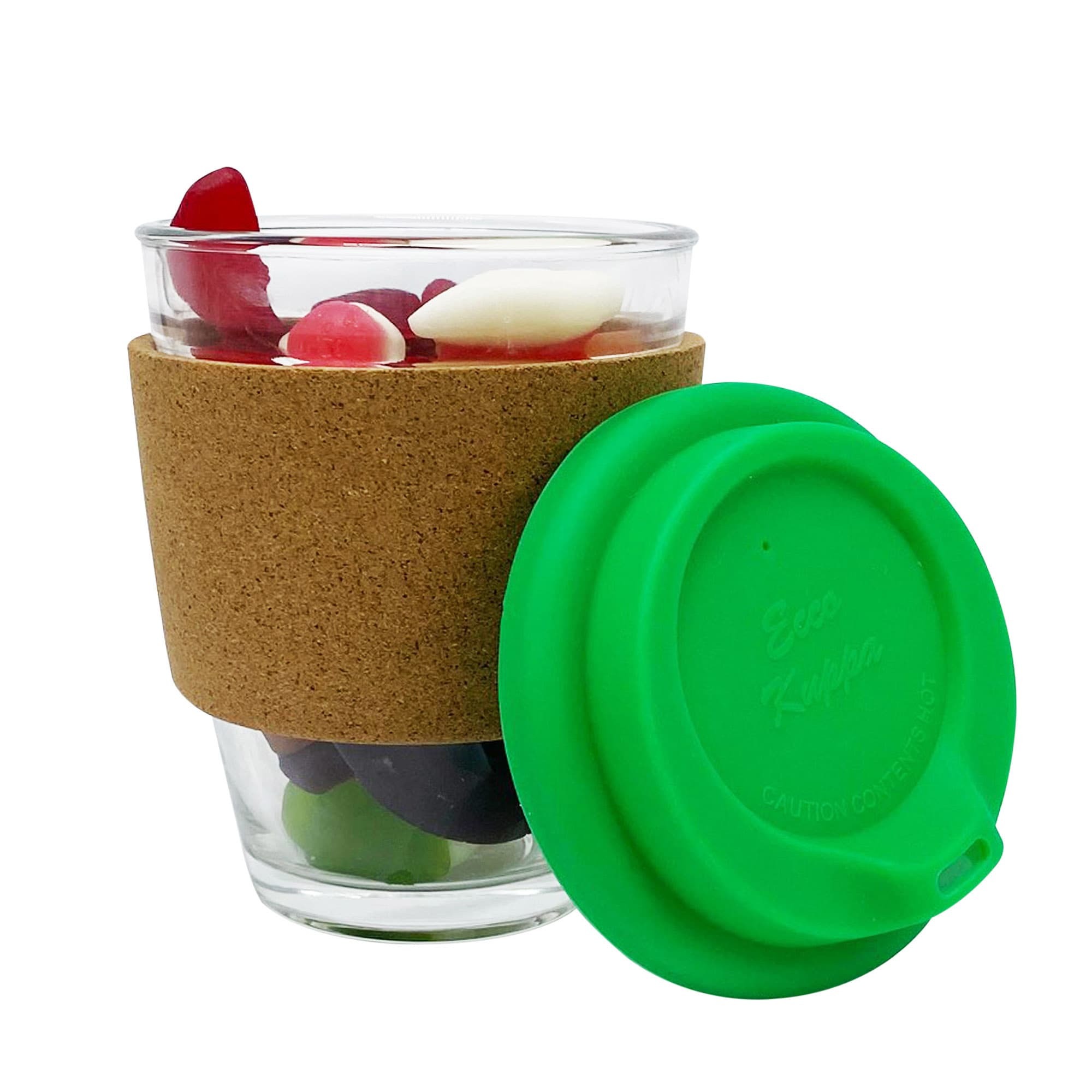
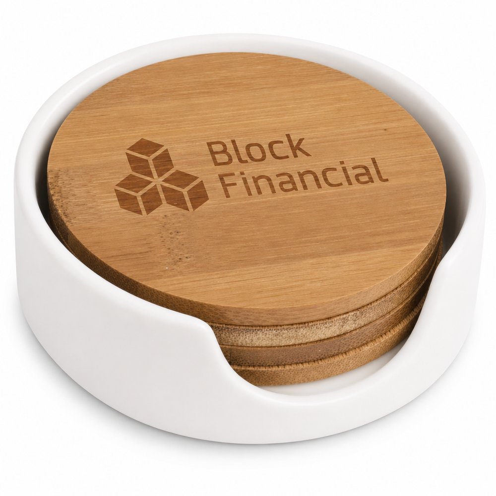
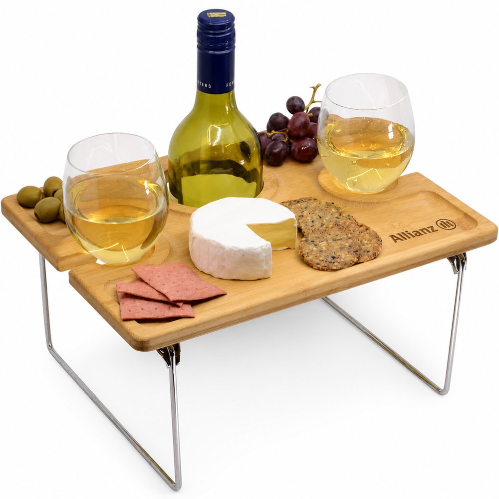
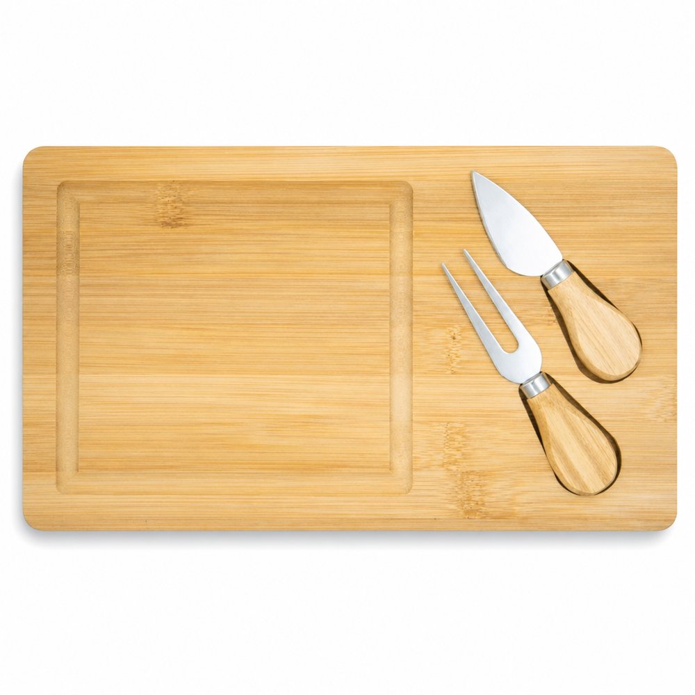
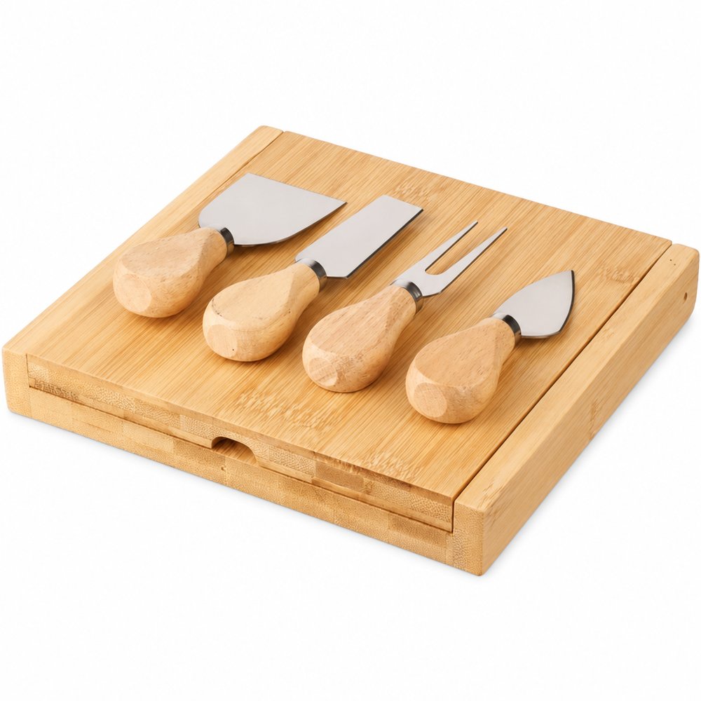
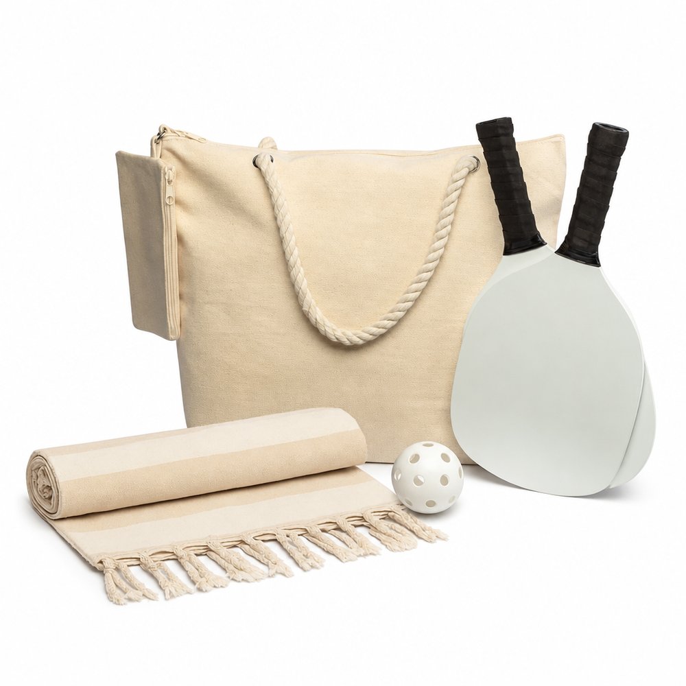
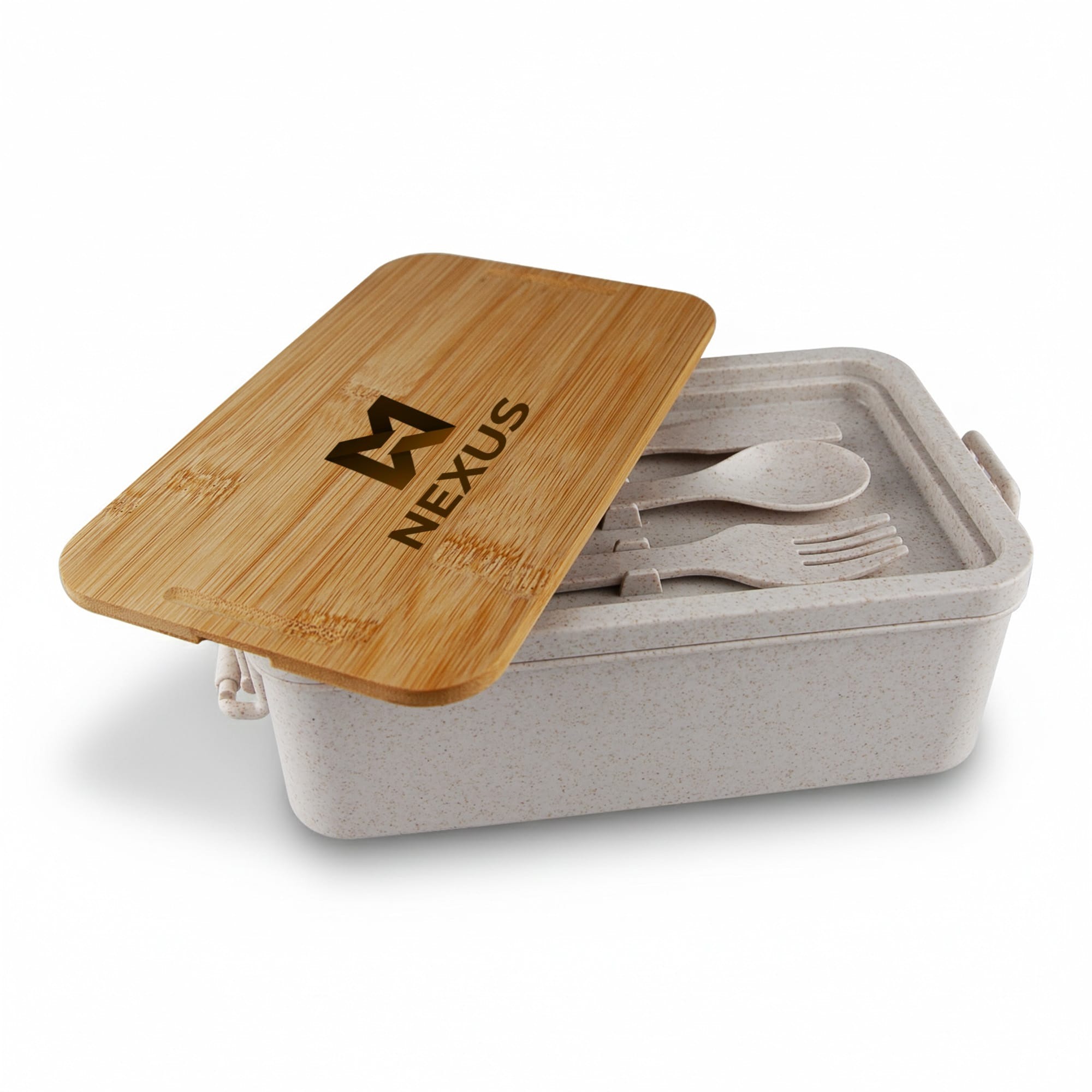
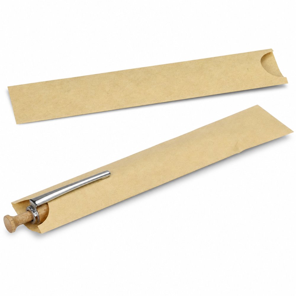
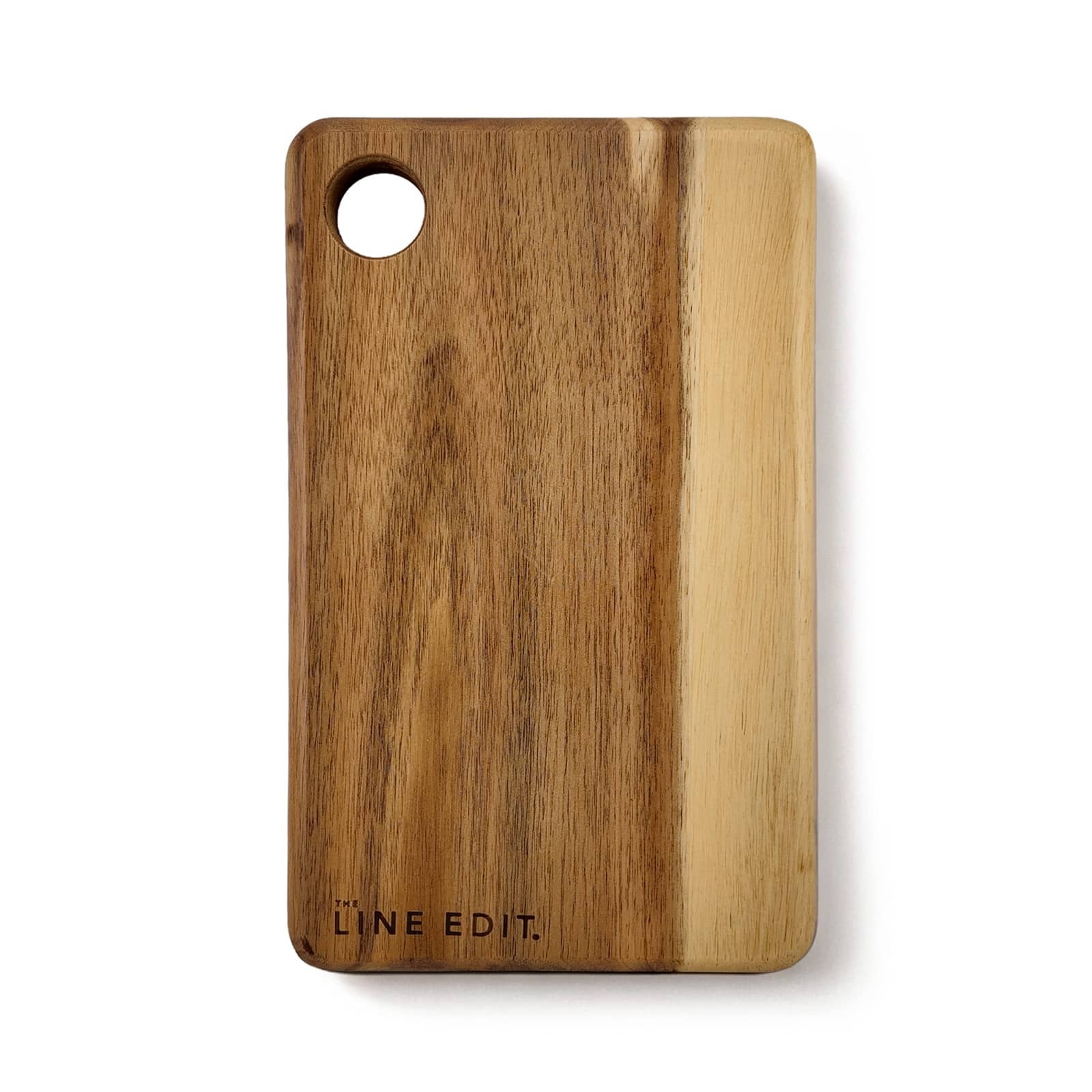
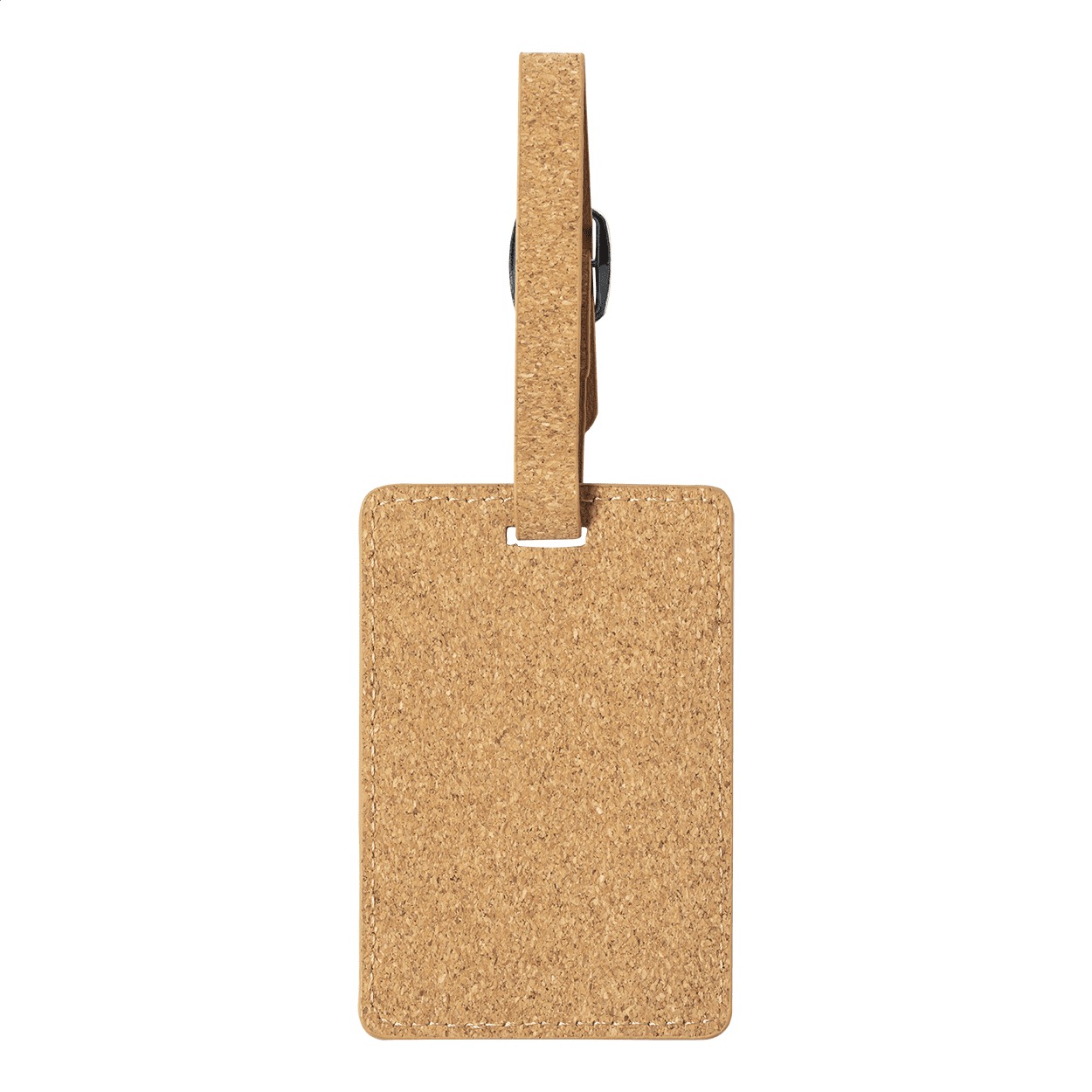
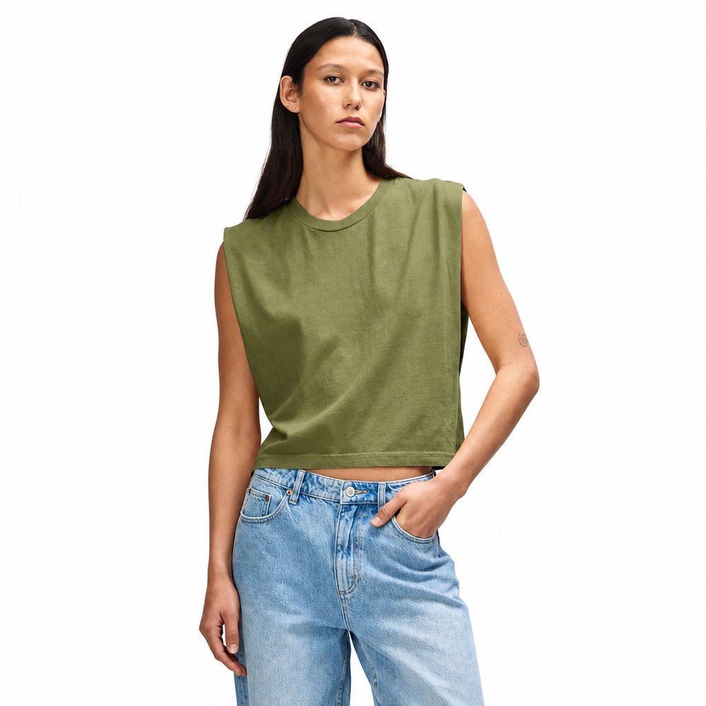
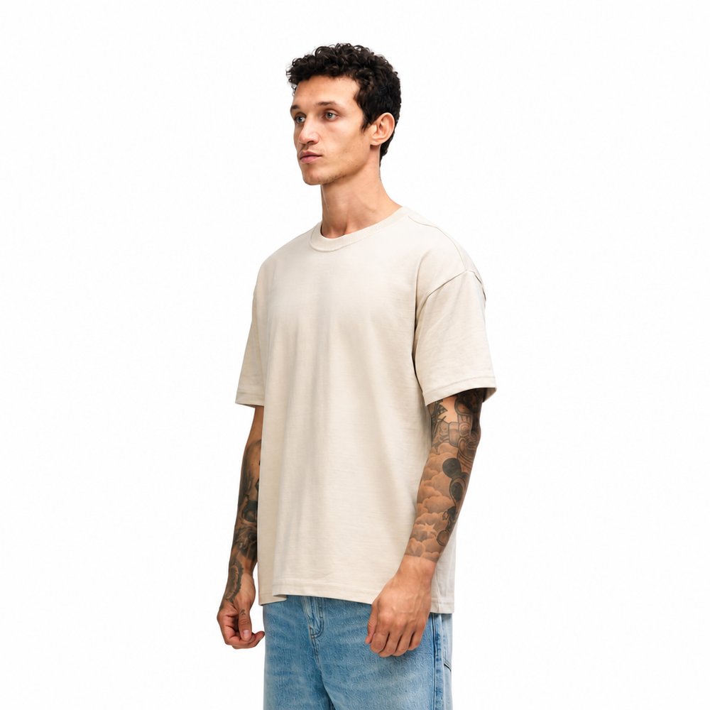
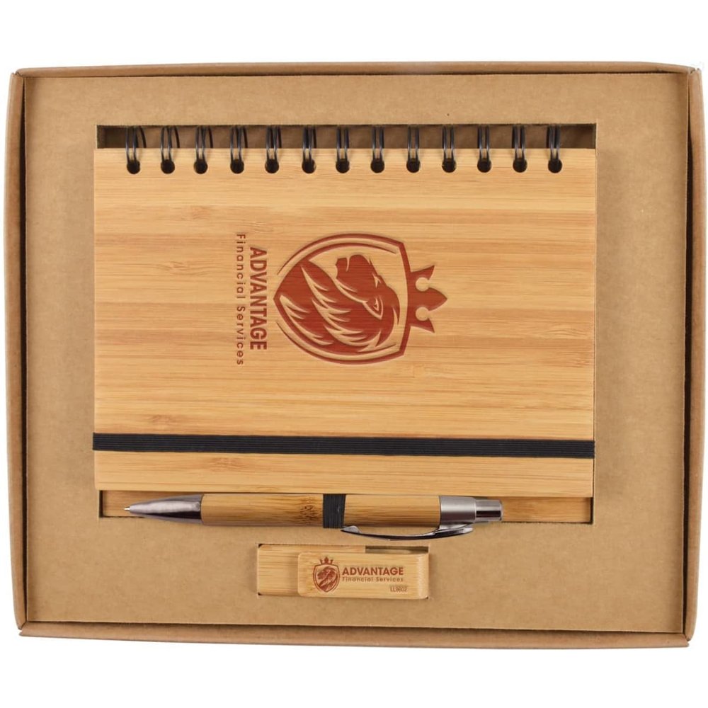
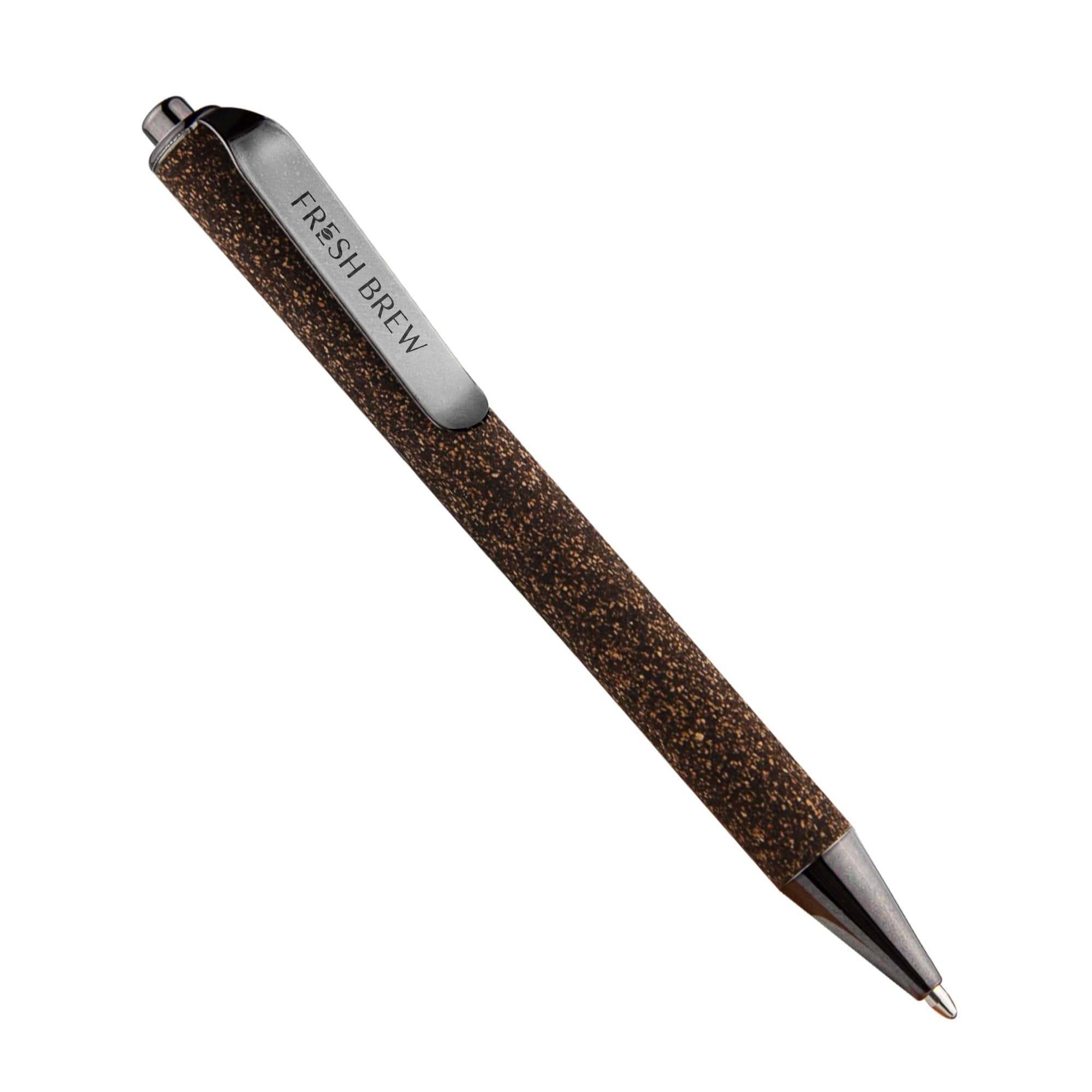
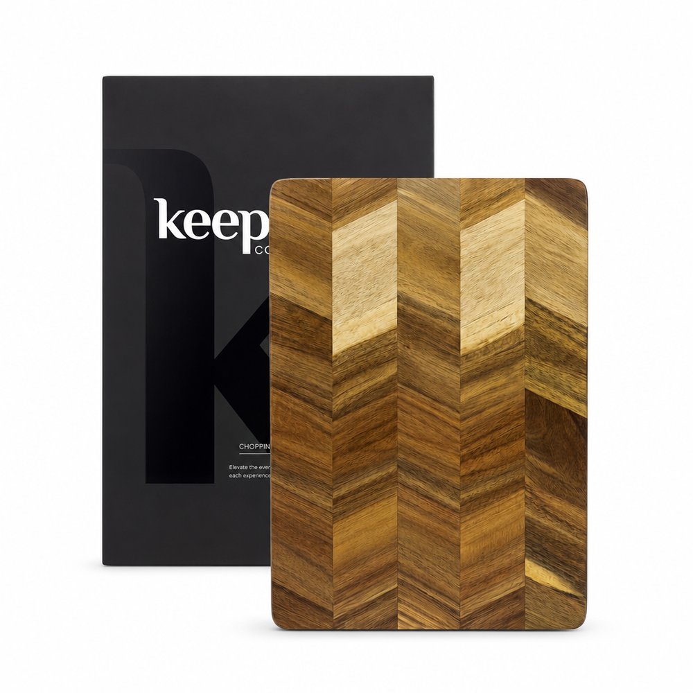
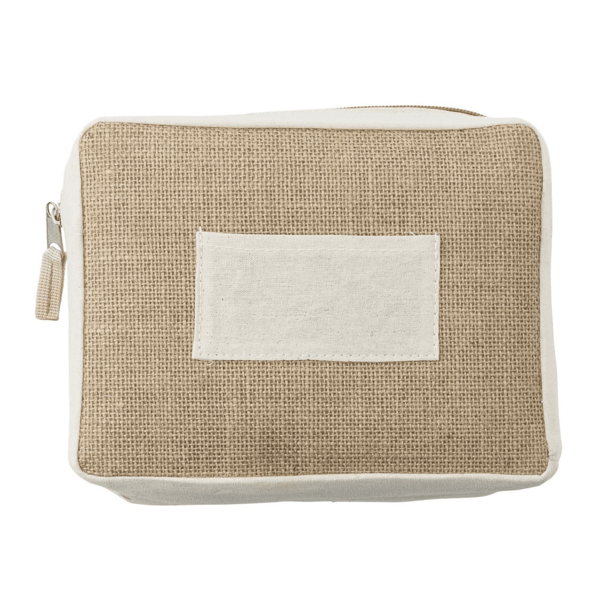
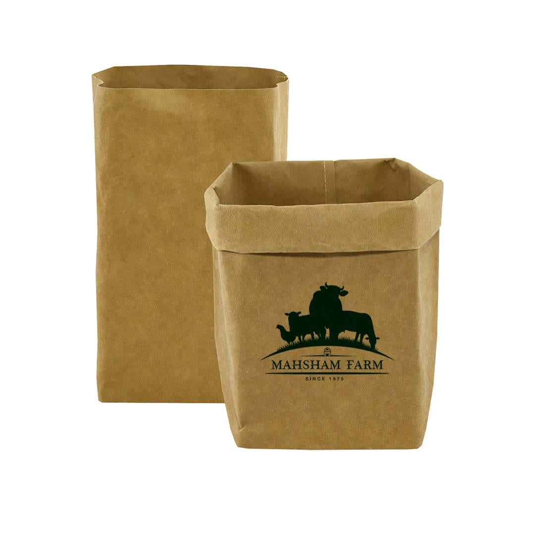
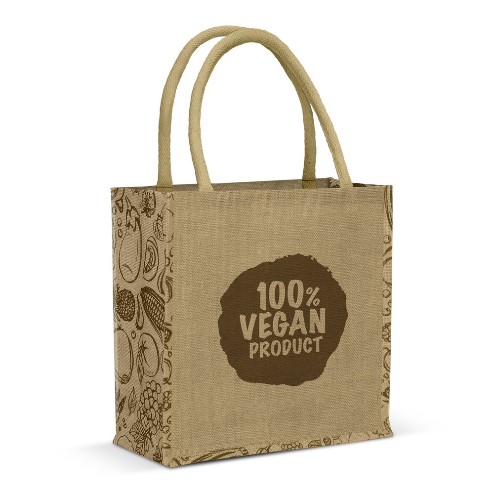
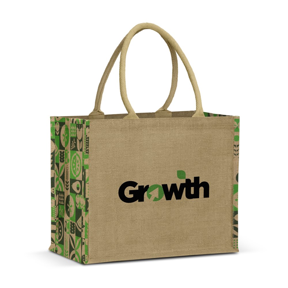
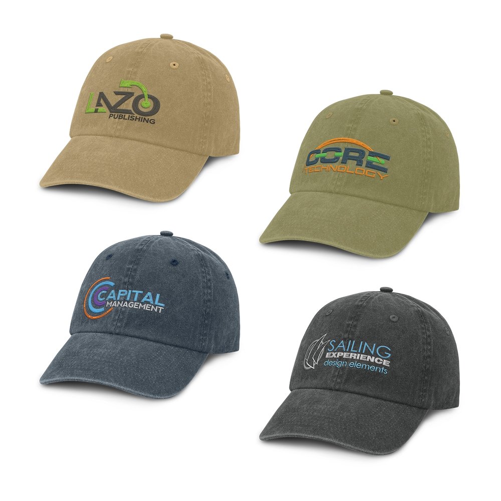
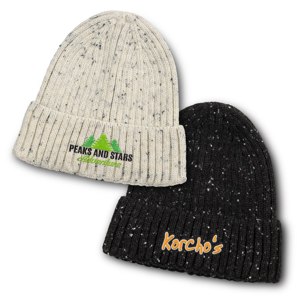
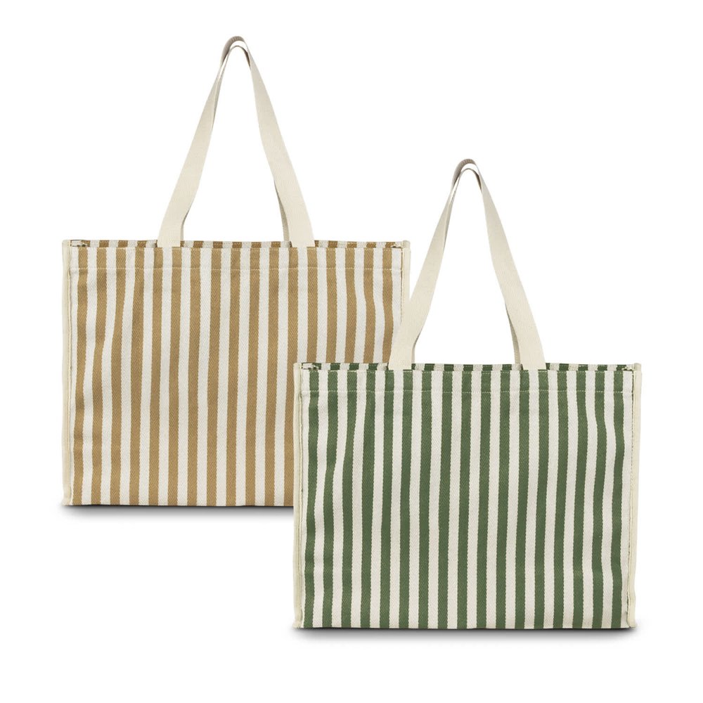
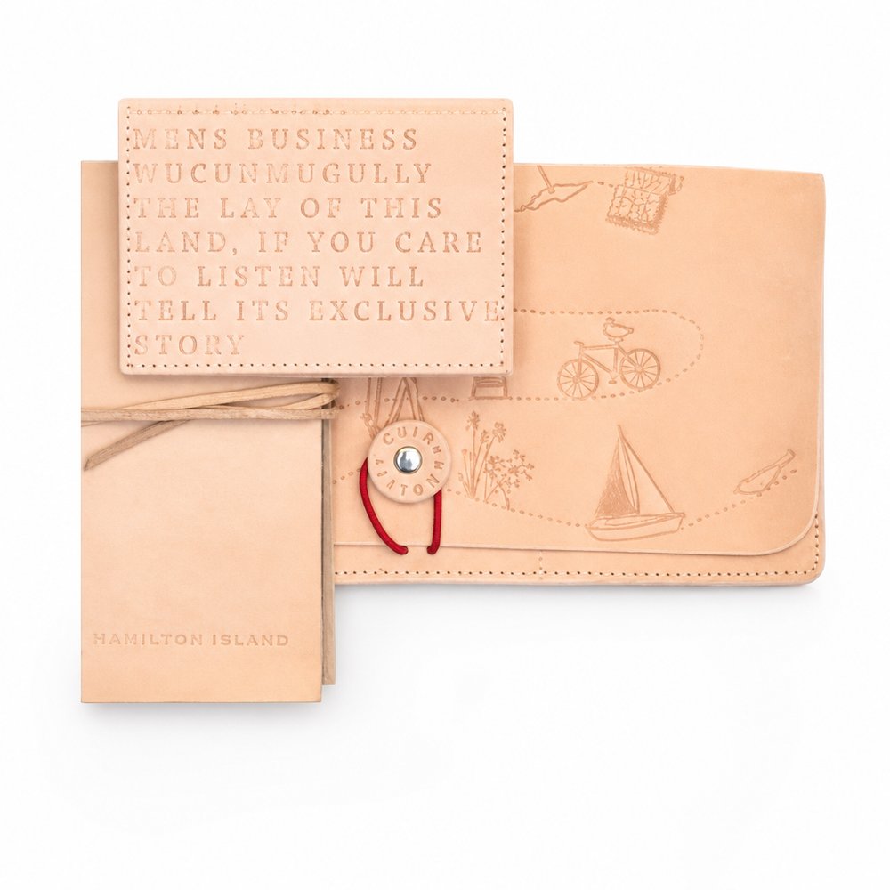
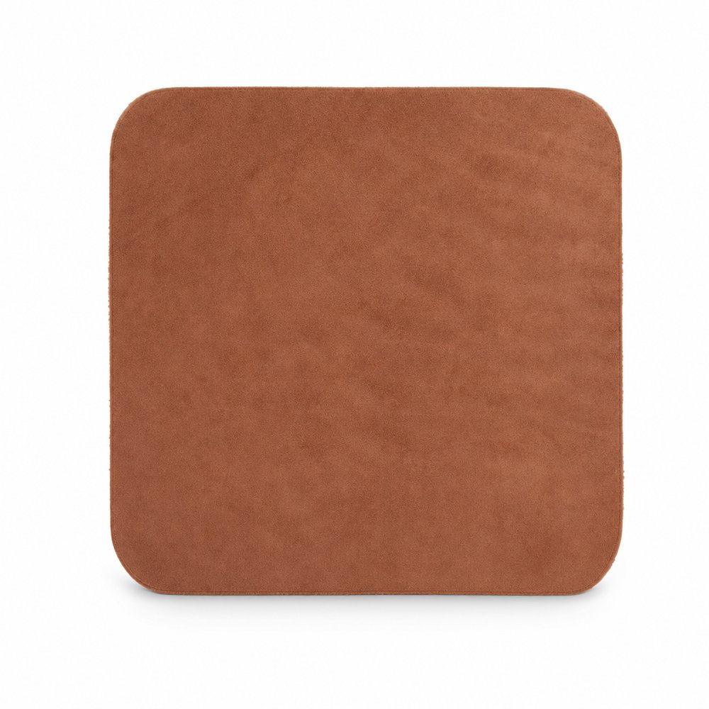
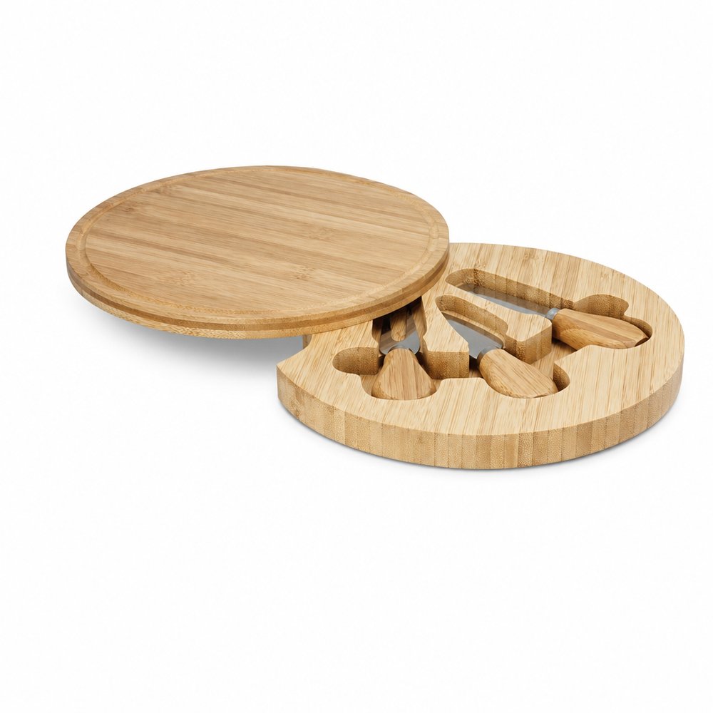
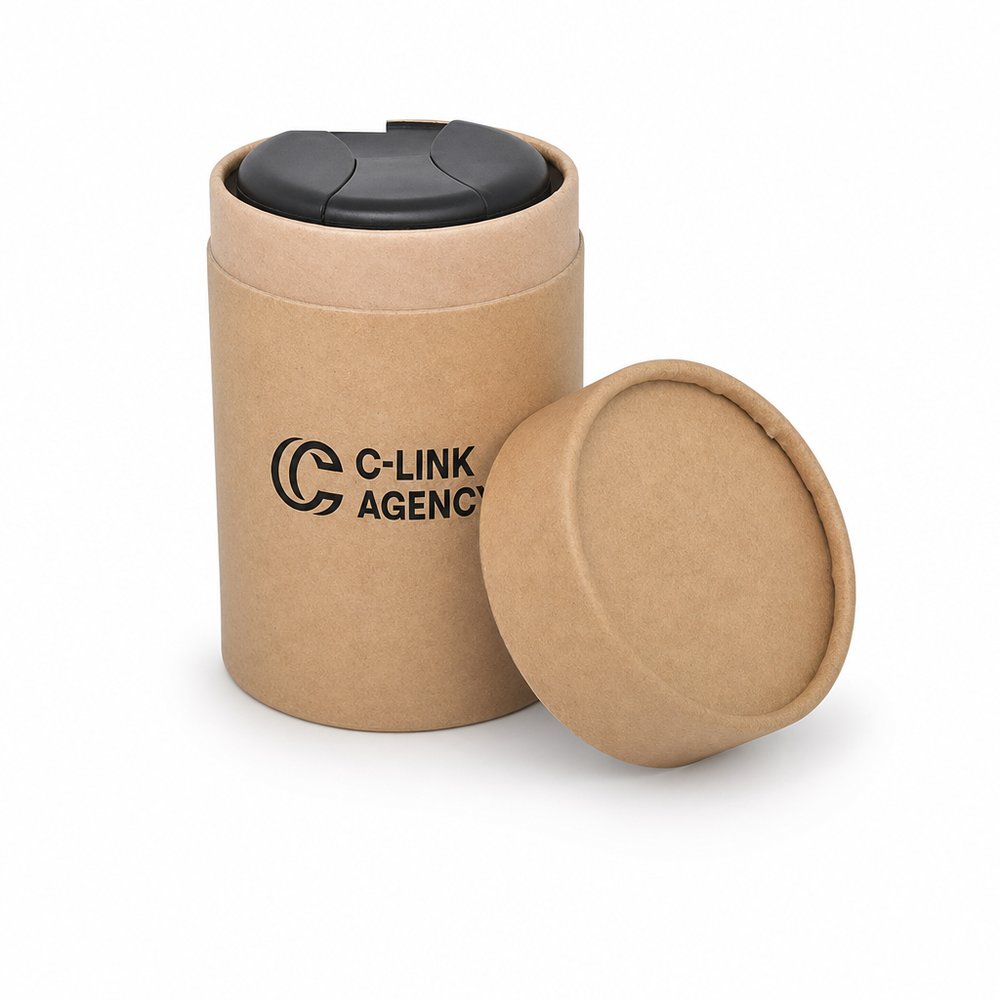
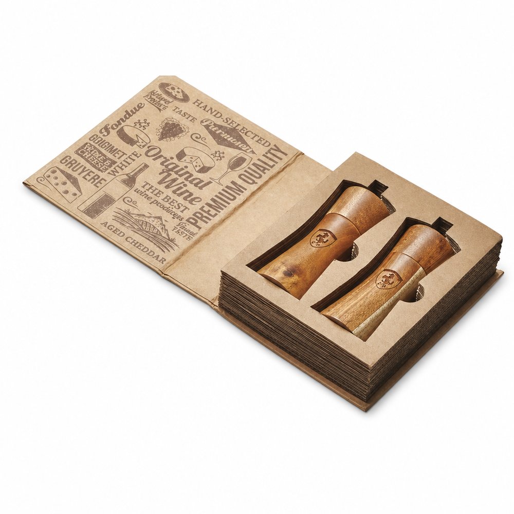
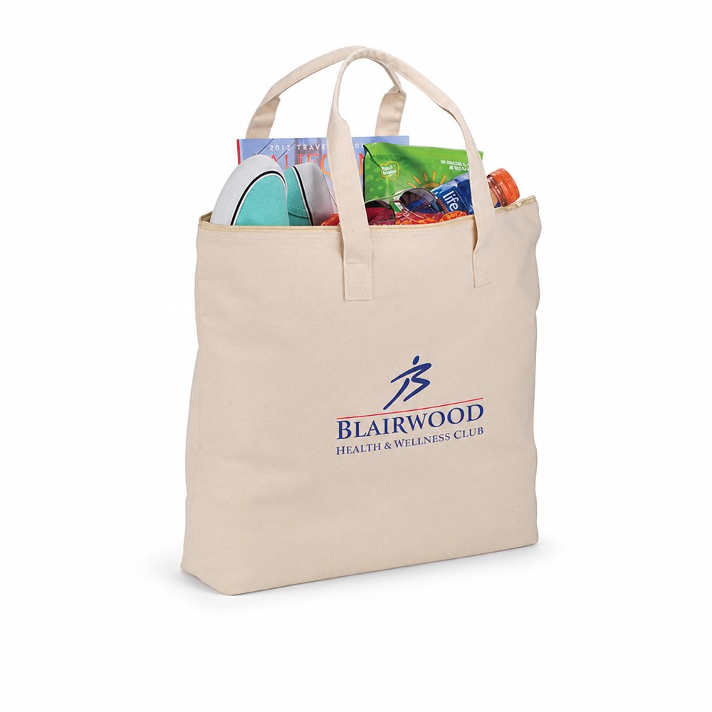
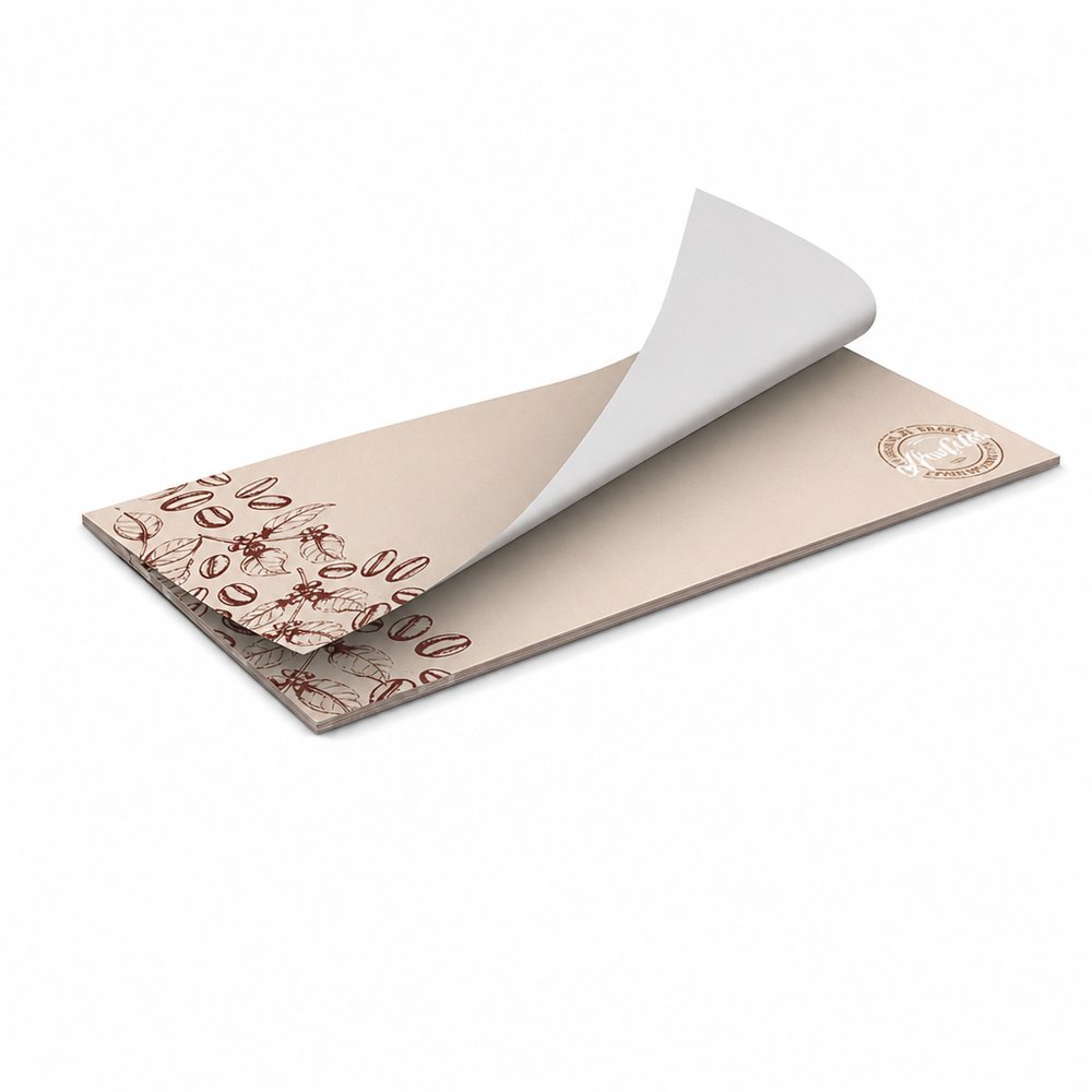
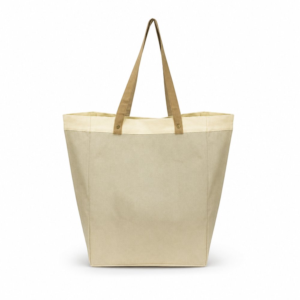
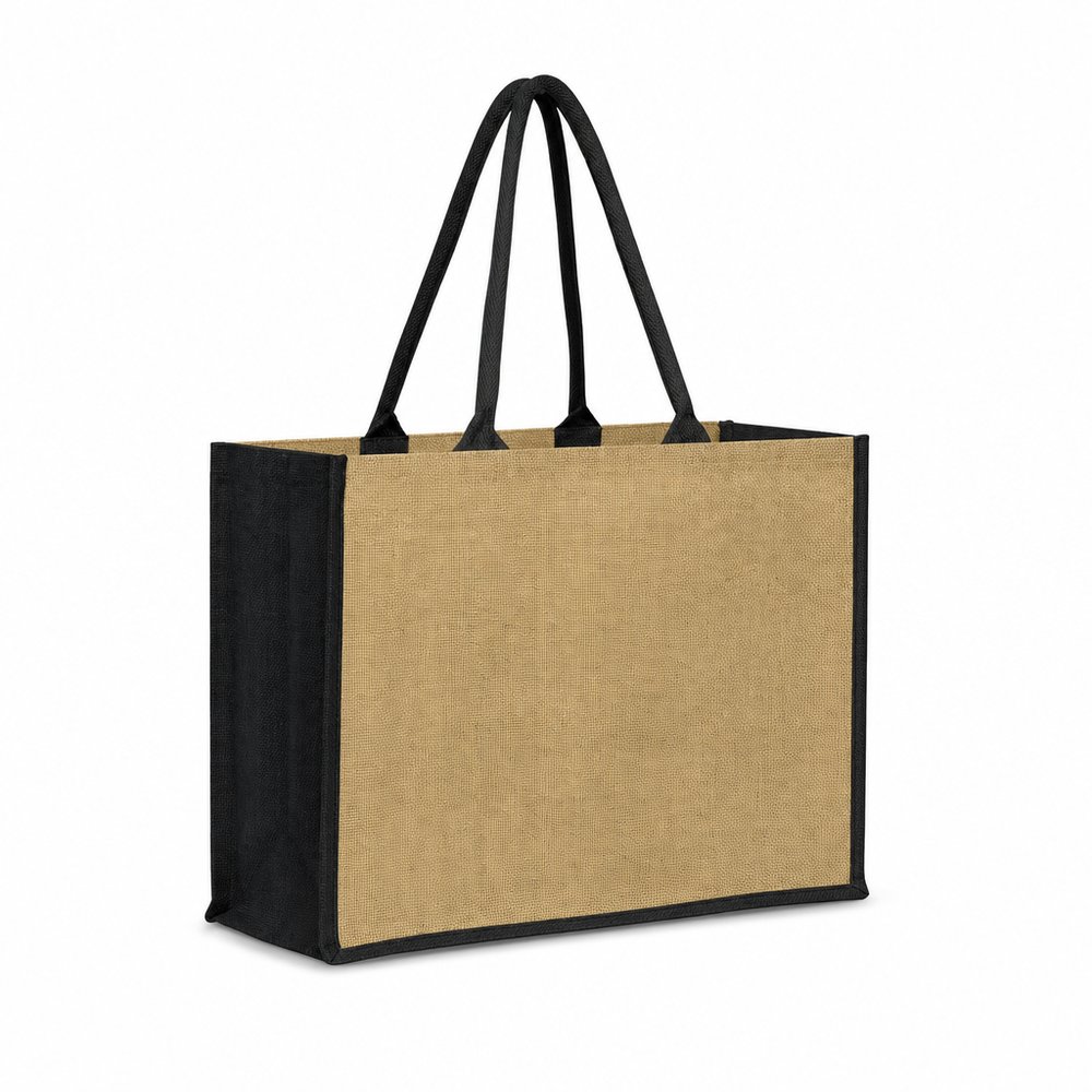
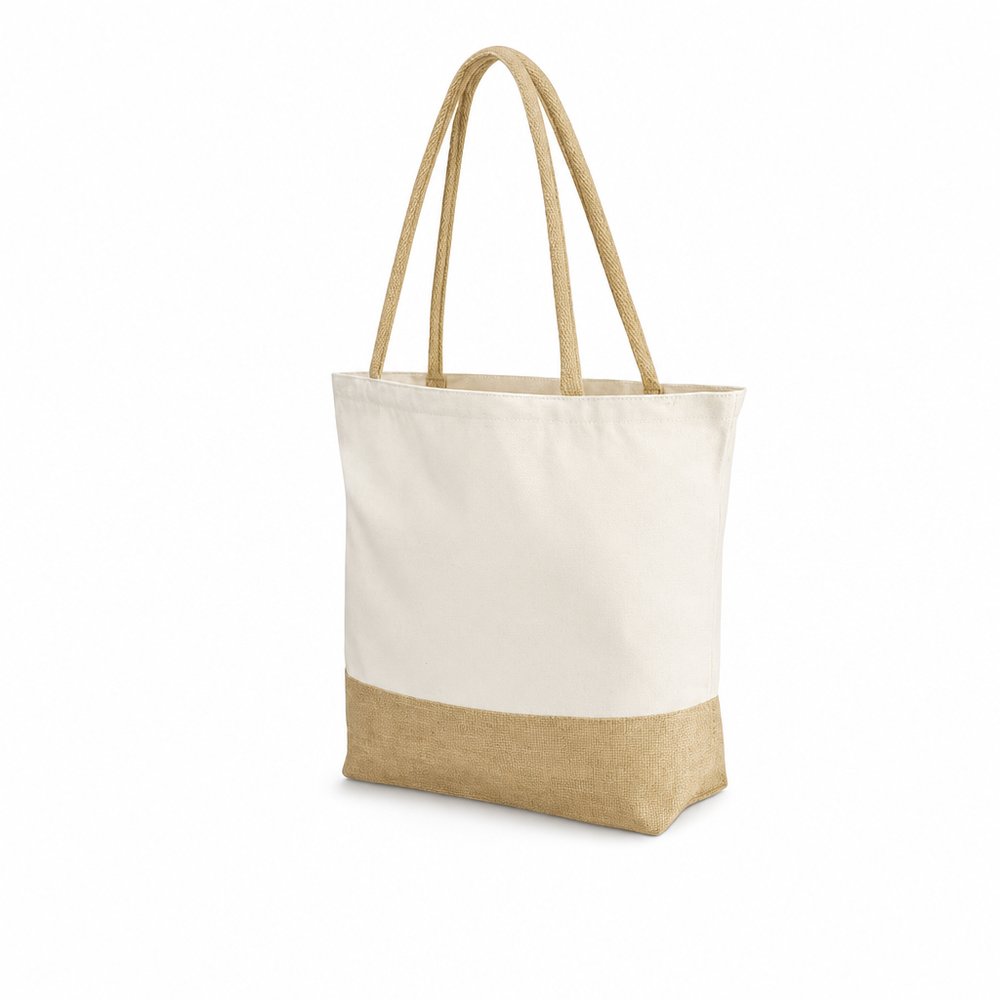
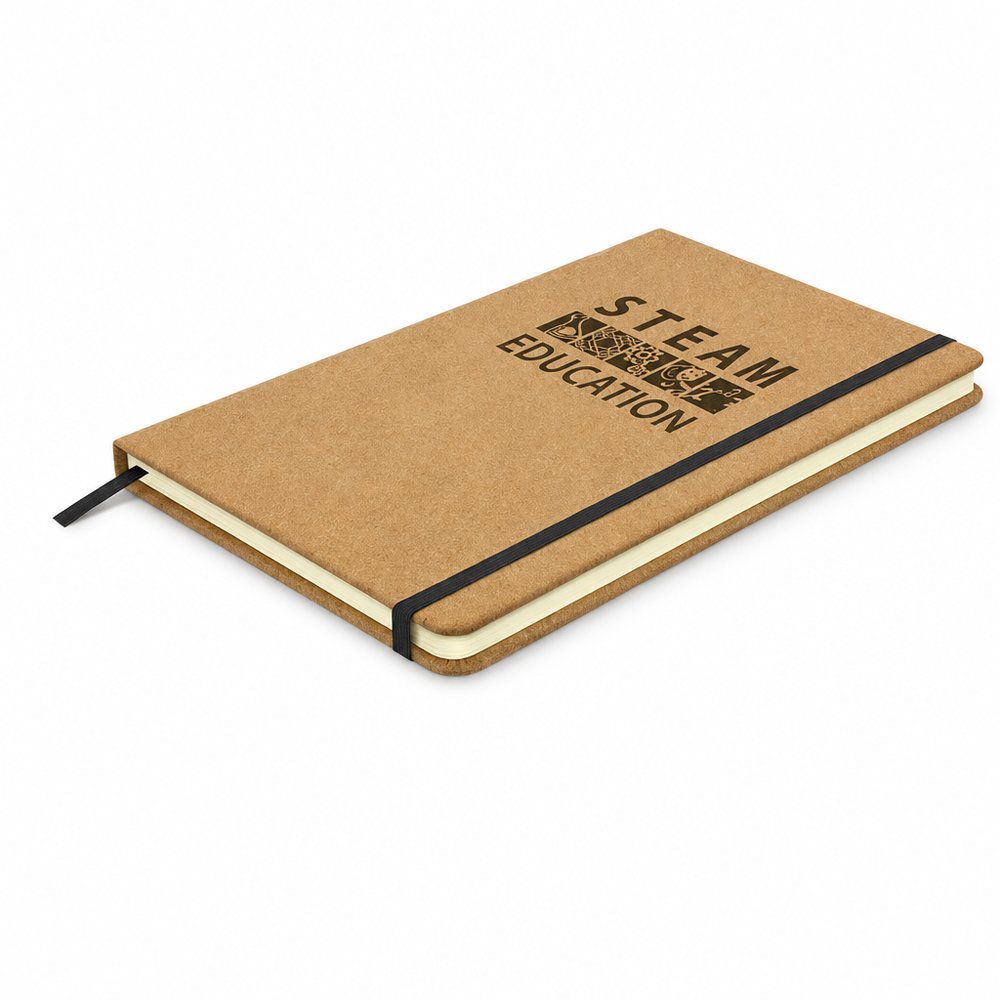
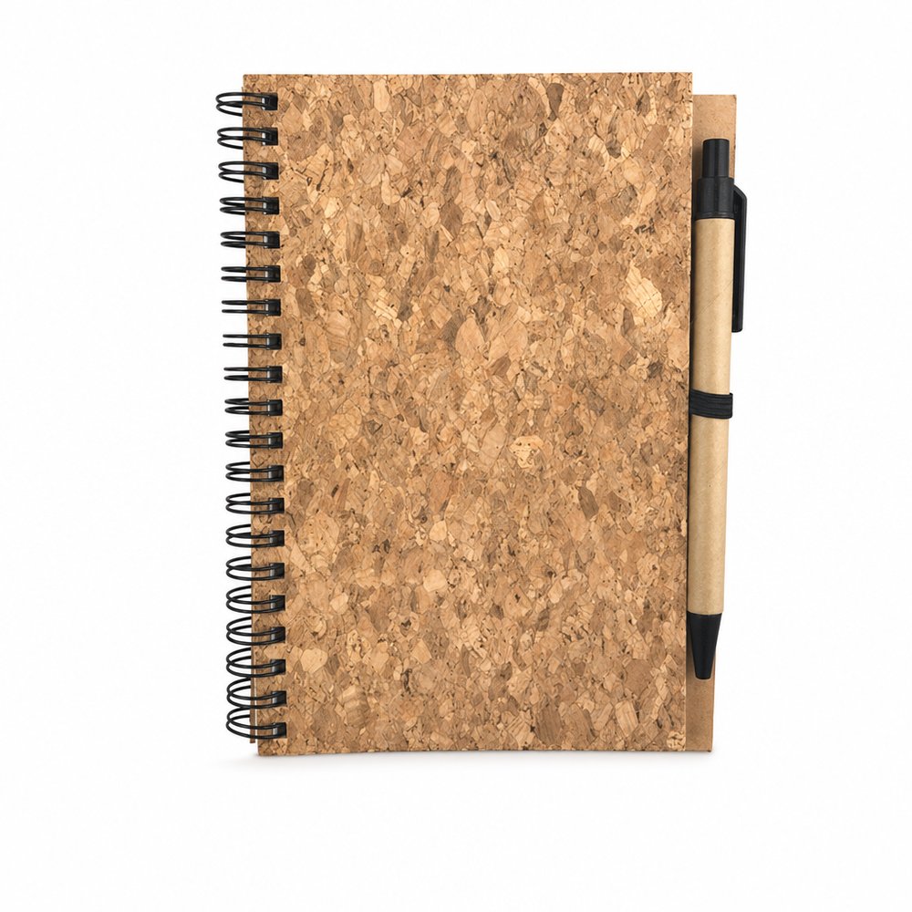
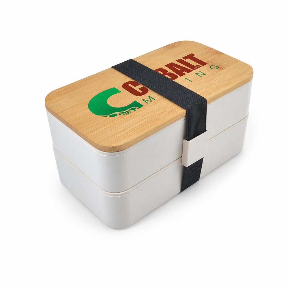
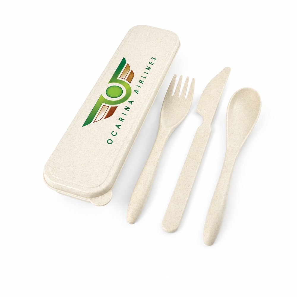
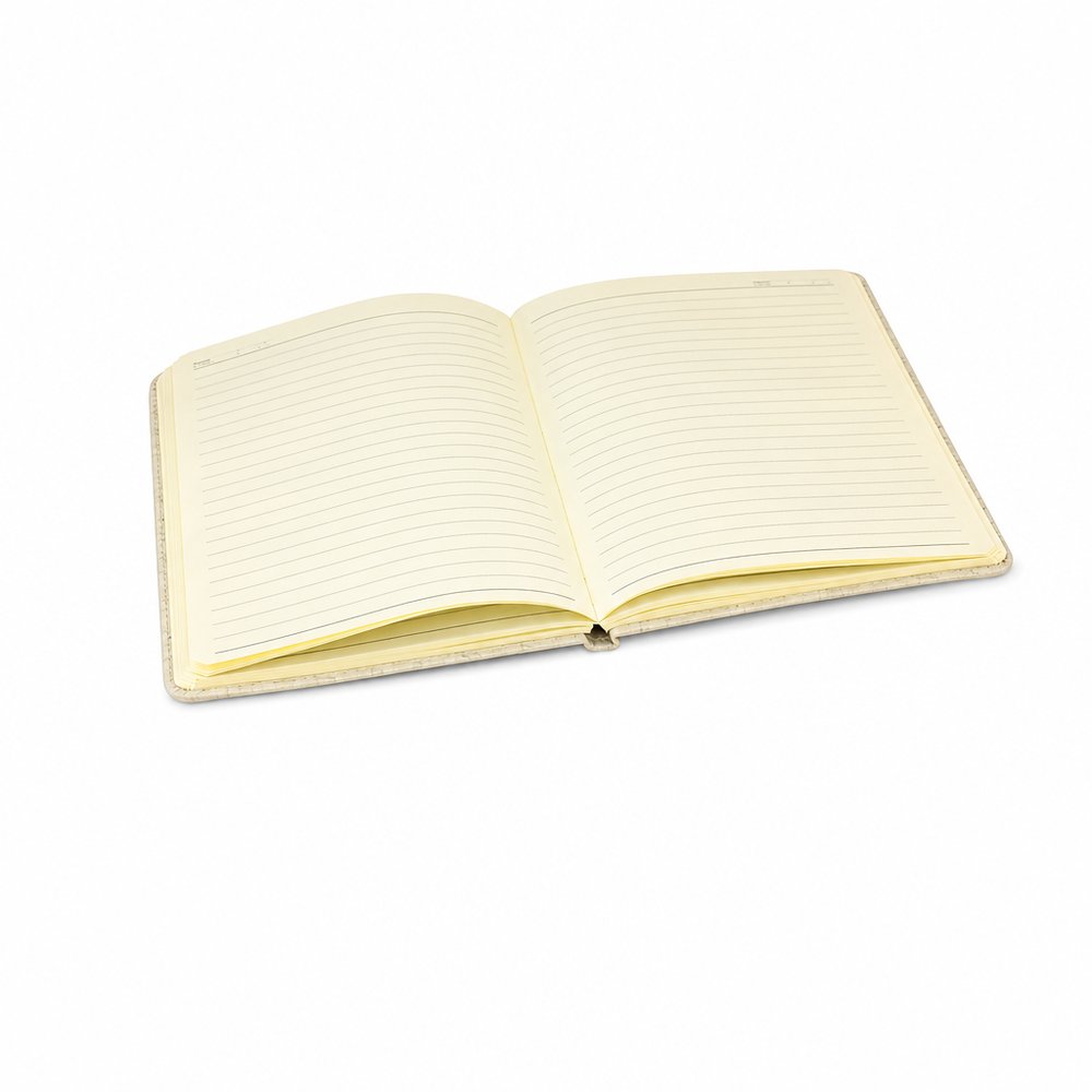
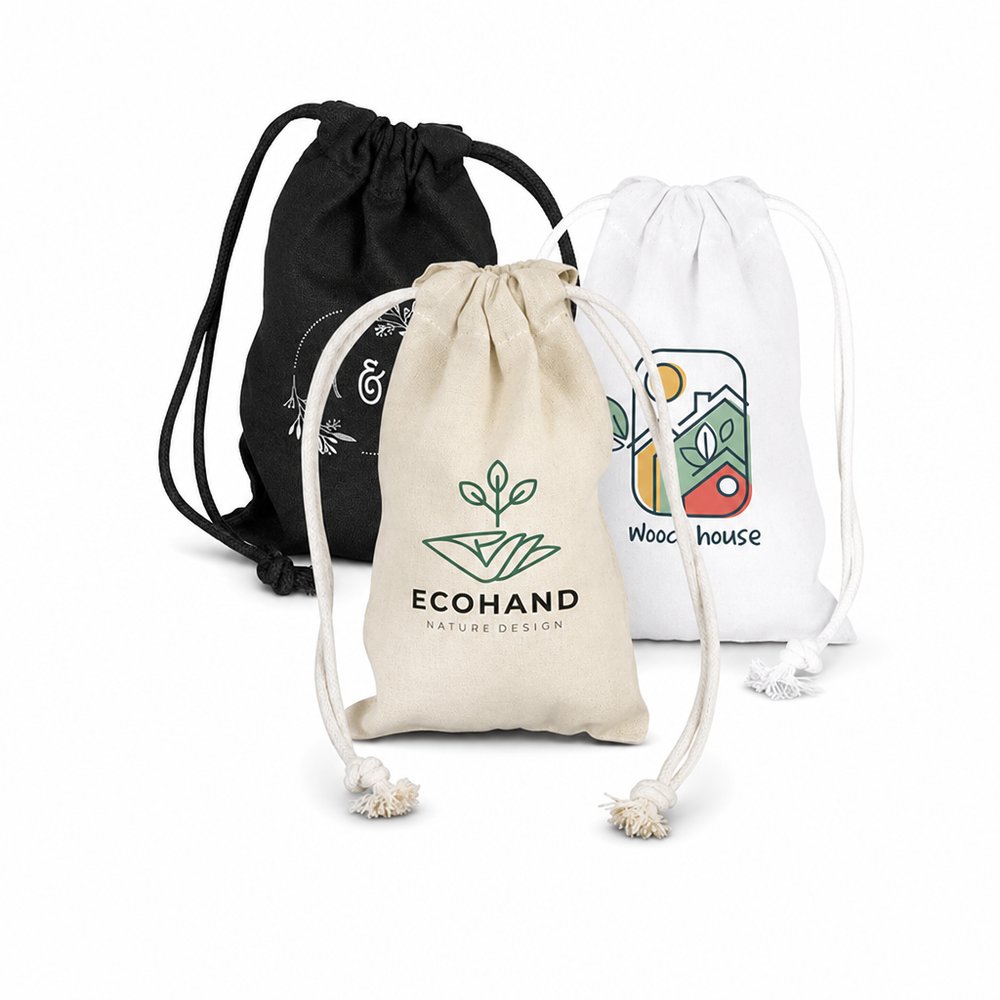
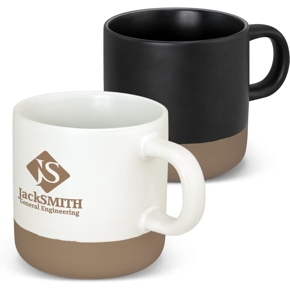
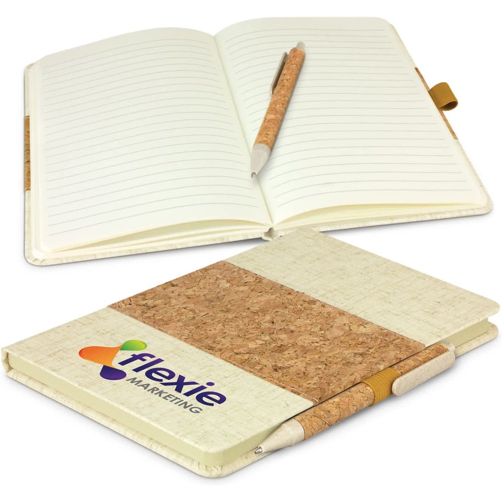
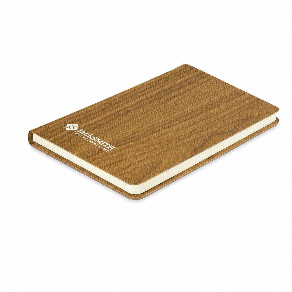
Warm, tactile and inviting. Perfect for wellness brands, cafés and companies wanting a softer visual identity.
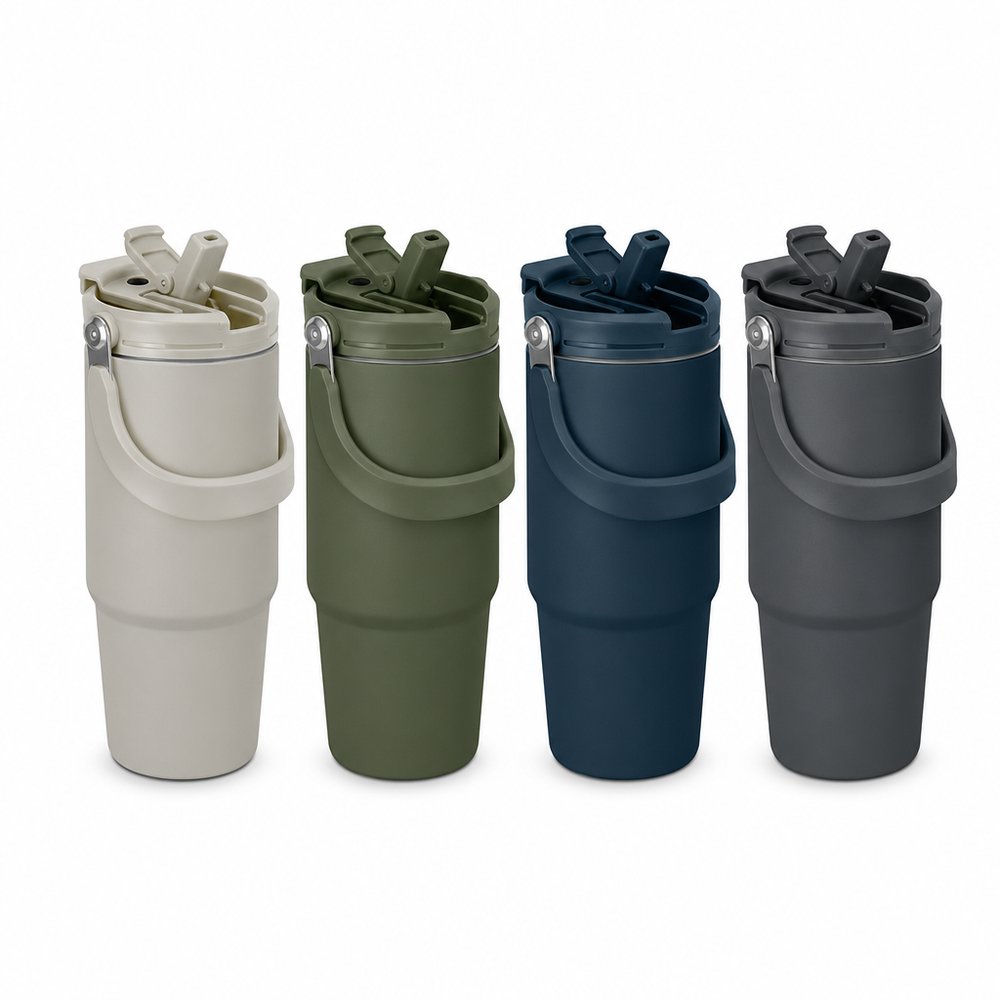
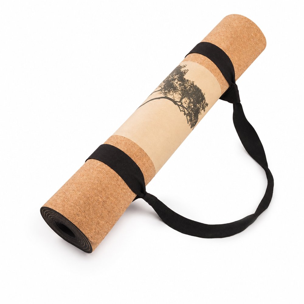
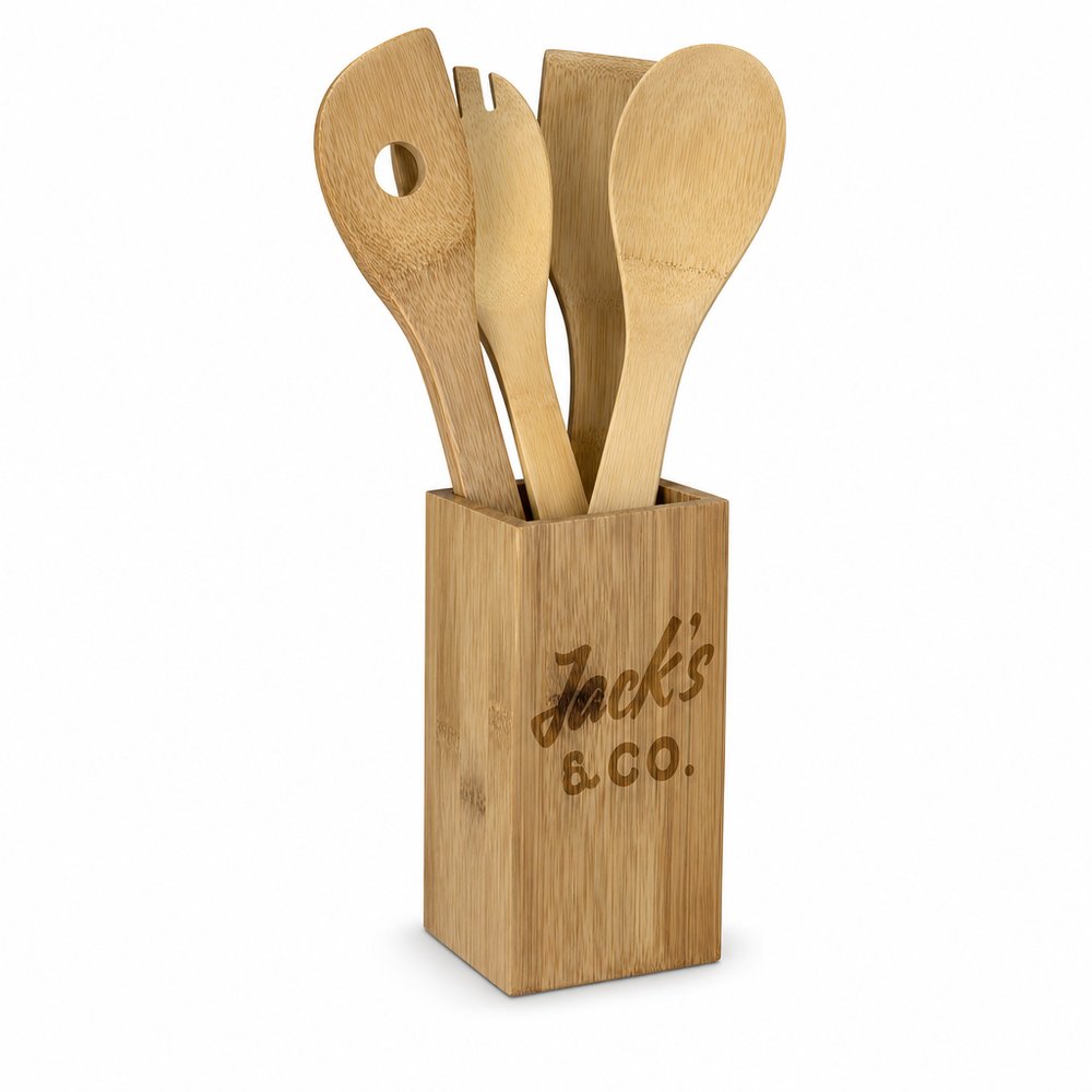
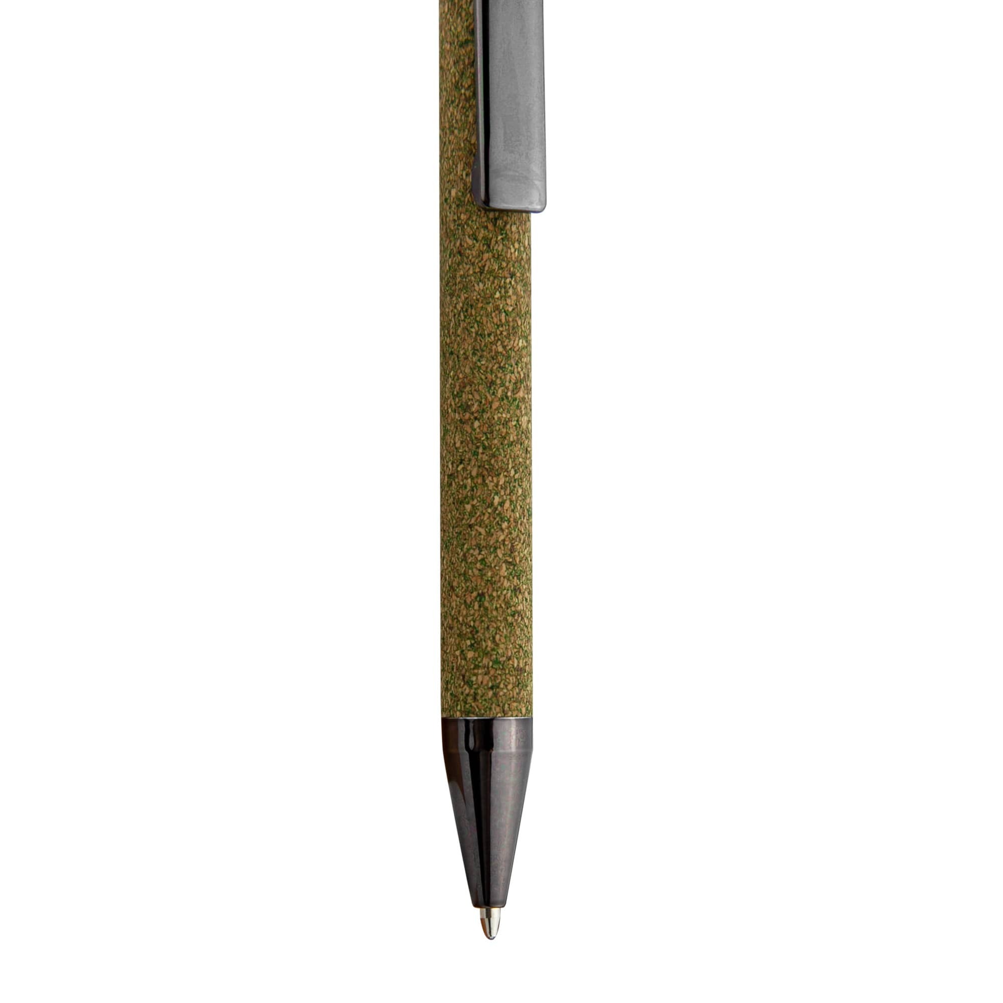
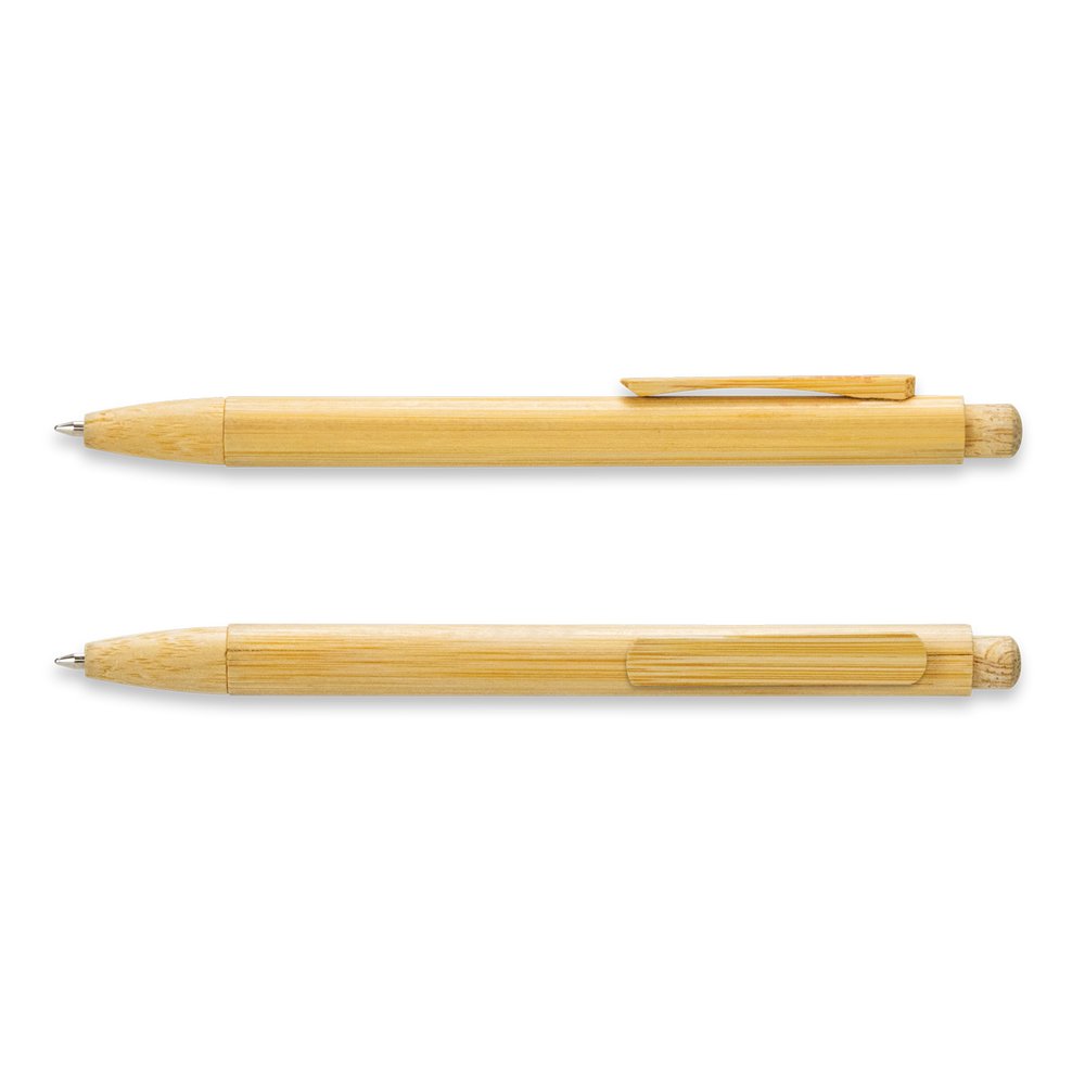
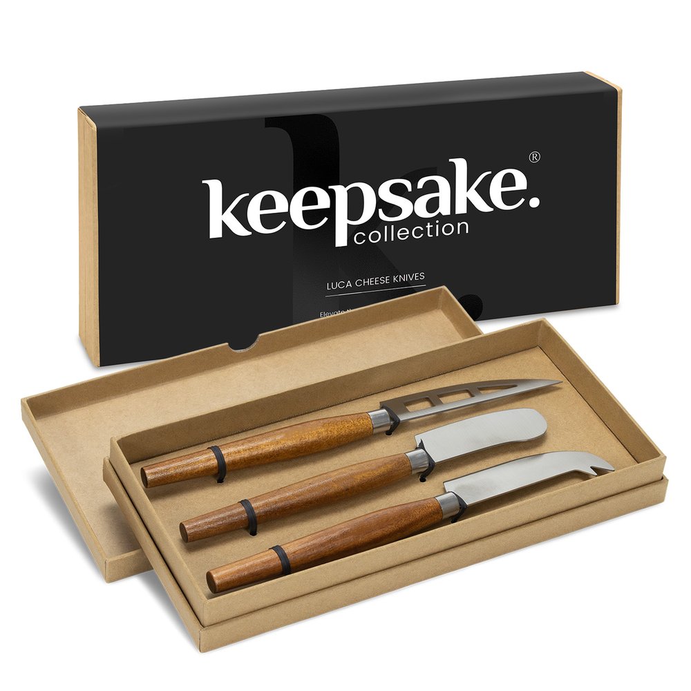
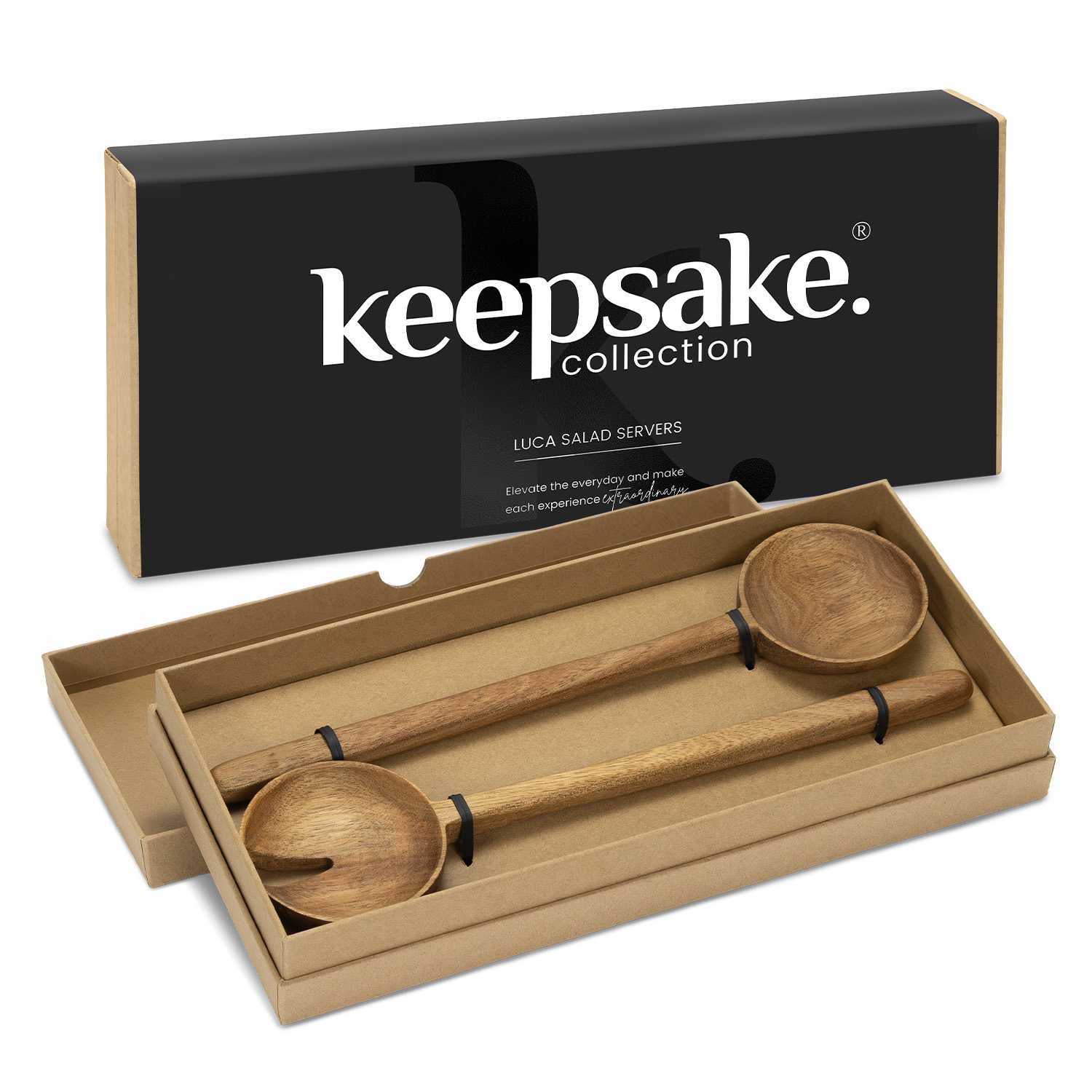
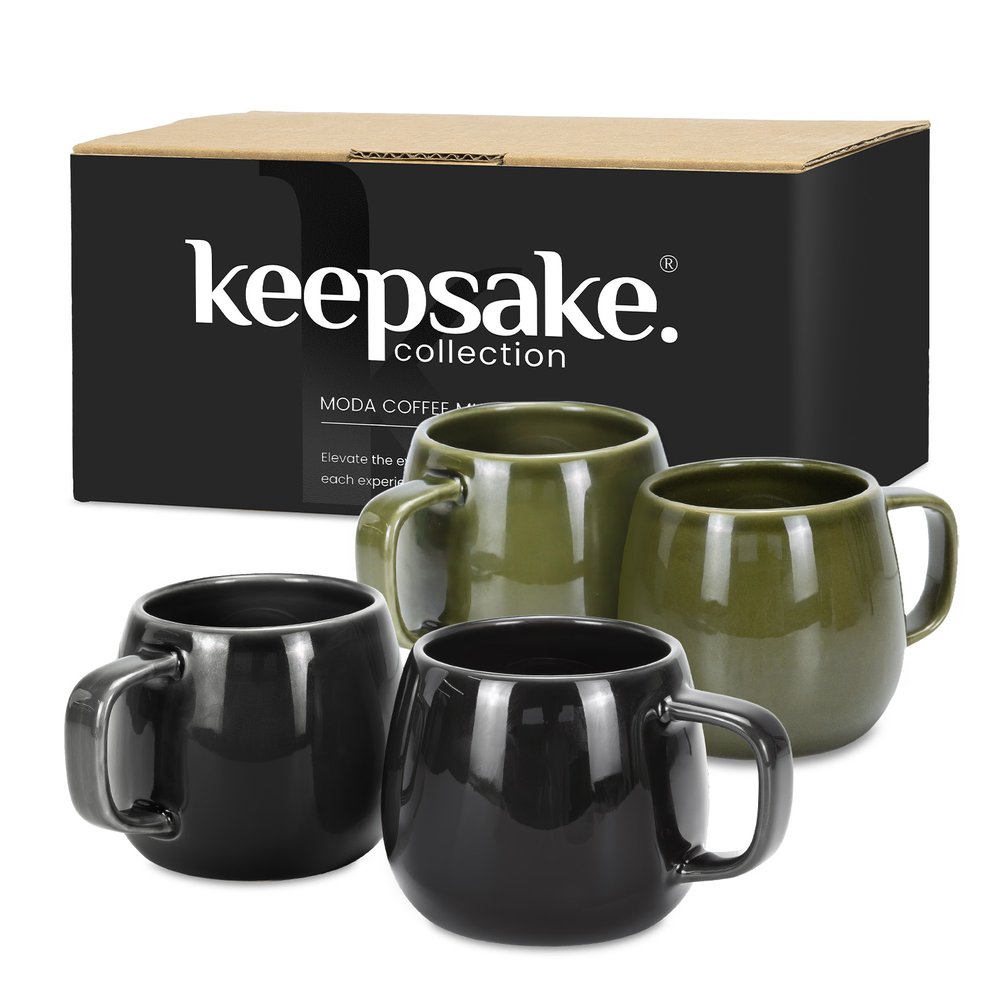
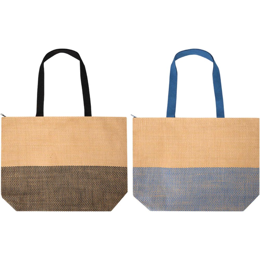
Think: Clay · Olive · Terracotta · Forest · StoneSee the hand-picked edit →
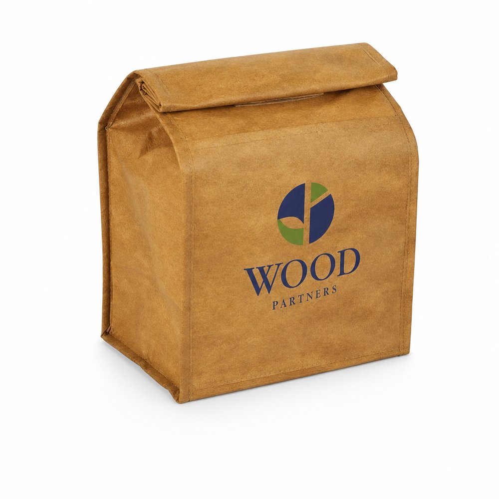
This is the masterclass in earthy branding done contemporary. The amber glass began as function — UV protection for botanical formulations — and Aesop turned it into the most recognisable shelf in global retail. The earthiness carries the natural-ingredient story on its own, so everything printed on it stays clinical: a spare serif wordmark, pharmacy-label typography, acres of negative space. That tension — warm material, cool information — is why Aesop reads as botanical AND scientific at once. For merch: pick one honest material (amber glass, stoneware, kraft), let it do all the warmth, and keep your print discipline strict.
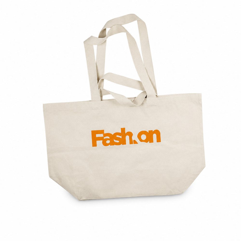
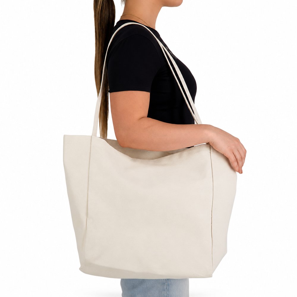
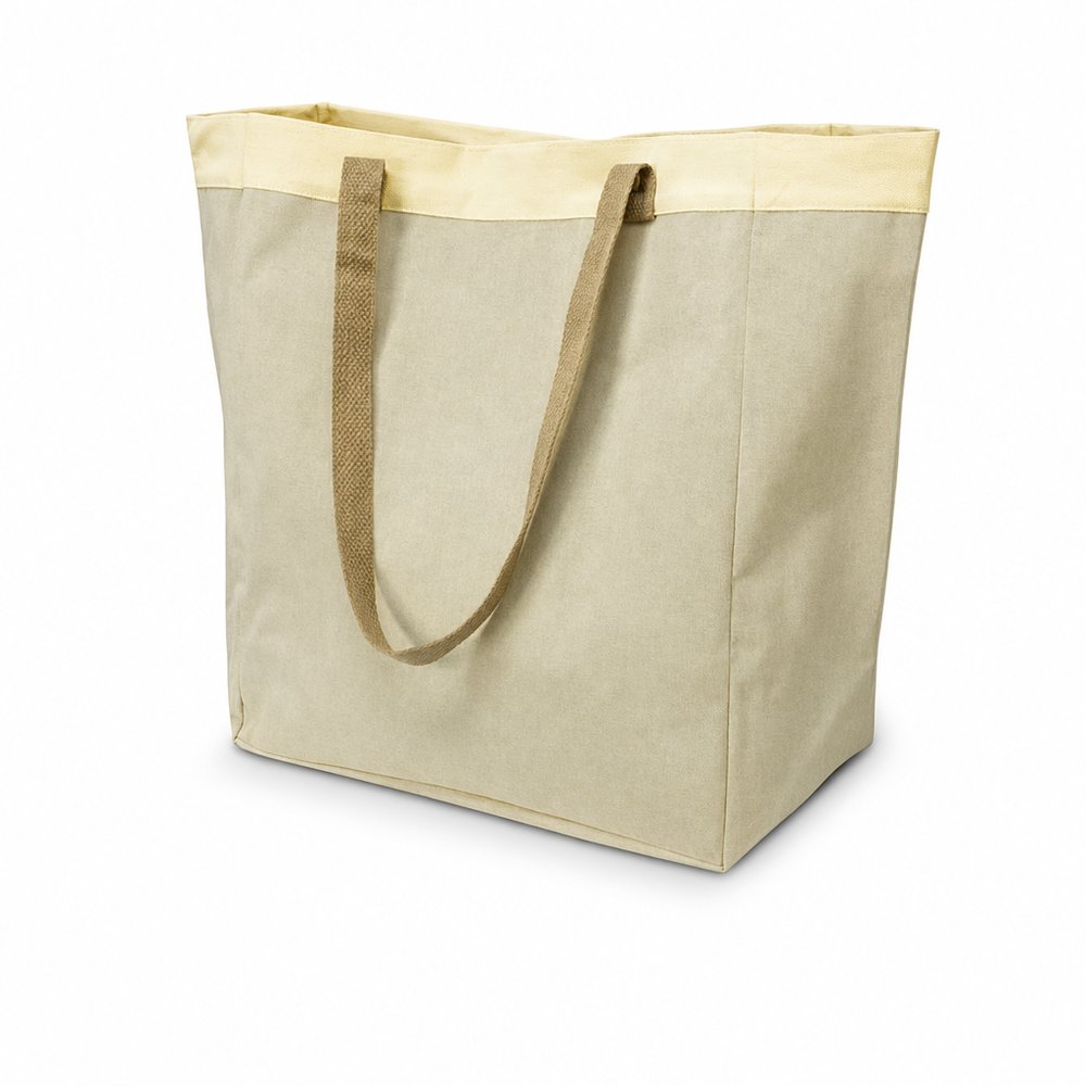
Read the full study →We travel to see colour — ochre deserts, teal shallows, rust canyons. This post nails why earth palettes work so hard in branding: they borrow emotional memory from landscapes people already love. A terracotta tote isn't 'brown merchandise'; it's the same colour as the place your customer daydreams about. When you brief an earth-tone range, name the landscape, not the Pantone.
Read the full study →


 Fast
Fast