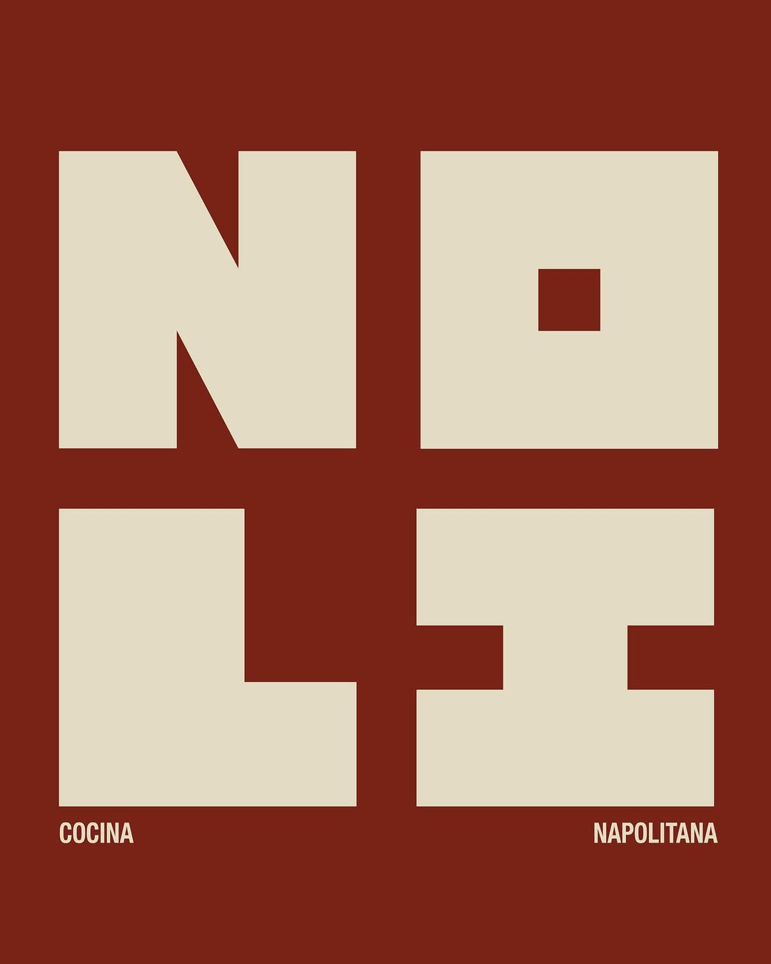


Brand crush
@ten.10.design
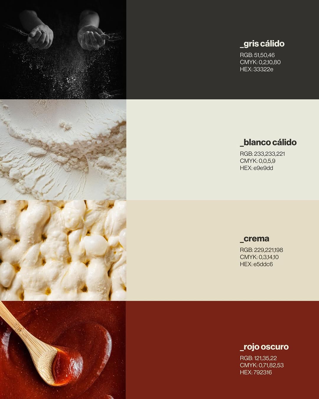
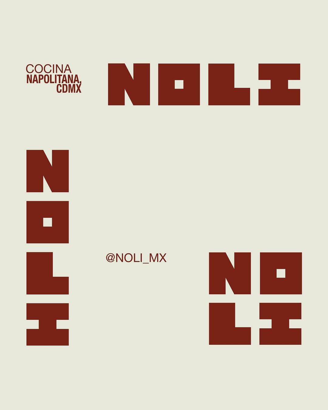
[ Naming + Branding Project ] NOLI — CDMX (Mexico)
Logo / Identidad / Colores / Tipografías / Texturas / Patterns
Prossimamente en Chicago 113, Esq Av. del Parque, Nápoles📍


Brand crush
[ Naming + Branding Project ] NOLI — CDMX (Mexico)
Logo / Identidad / Colores / Tipografías / Texturas / Patterns
Prossimamente en Chicago 113, Esq Av. del Parque, Nápoles📍
More moments worth a look.

A heavy hit of stark white screenprint on a dense, matte black surface commands a very specific kind of authority. Stripping back the design to a utilitarian grid and high-contrast typography signals absolute confidence in the message over the medium.

Single-colour flexo print on a bleached kraft stock proves you do not need a four-colour process to hold attention. They have used the sheer scale of the vertical block typography to turn a standard takeaway vessel into a walking billboard, while the matte terracotta ink grounds it in a tactile warmth.

Someone clearly got tired of the standard 'make the logo bigger' feedback and decided to let a heavy sans-serif spill completely off the edges of the kraft stock. They have turned a standard paper bag into a typographic puzzle by letting the folds break the words, forcing the brain to pause and decode it.
Ask Findie for a quick conversation, or hand the brief to Susan and the team. Either works.