brutalist typography, raw kraft, unapologetic

Brand crush

Brand study

Identity by sense2lovesbranding

edge-to-edge-typographybrutalist typography, raw kraft, unapologetic

Someone clearly got tired of the standard 'make the logo bigger' feedback and decided to let a heavy sans-serif spill completely off the edges of the kraft stock. They have turned a standard paper bag into a typographic puzzle by letting the folds break the words, forcing the brain to pause and decode it.

The portable idea

Stop treating your packaging like a polite name tag. When you scale a single font up until it falls off the edges of the material, the letters stop being reading material and become a structural texture. It is a highly cost-effective way to make off-the-shelf stock look completely custom without paying for complex die-cuts or multiple ink colours.

May 20, 2026
Steal this for your brand world

Findie's translation of the move above into specific Sense2 products by industry. Pick the row that fits your brief — pricing is per piece at minimum order quantity.

The Brand Move

Letting the type spill off the edges of the kraft

Part of the sustainable by design aesthetic →

What makes it work

Someone got tired of make-the-logo-bigger and let a heavy sans-serif spill completely off the edges of the kraft stock, turning a standard paper bag into a typographic statement. Edge-to-edge typography treats the humble unbleached bag as a canvas worth filling with conviction. For a sustainable brand it's a smart signal, honest recycled material, unapologetic confidence, no gloss required. It argues for cropping bold type hard against the edges of raw stock rather than centring a tidy mark. The nerve does the branding. When a plain kraft bag carries type this assured, it reads as a deliberate choice rather than a budget one, and eco packaging that looks chosen, not compromised, is exactly what shifts recycled from worthy to wanted.

What it signals

Use this aesthetic when sustainability is a claim you can prove — it's the visual language of certification, recycled content and refill systems. In 2026 the greenwash backlash is fully priced in: consumers expect the eco story printed on the object with numbers attached. Design-wise that means honest materials shown raw, single-material construction, and green used as an accent rather than a costume.

Apply it to merchandise

This move translates naturally to B-Corps & social enterprises, Councils & government programs, Universities, Renewables & climate tech, Outdoor & conservation brands, and FMCG refill pioneers.

Who owns this look

  • Patagonia:the benchmark — repair culture and materials honesty as four decades of identity
  • Who Gives A Crap:Australian proof that sustainable can be loud, funny and shelf-dominant
  • Seed Phytonutrients:shower-safe paper bottles that made the material innovation the hero
  • KeepCup:Melbourne-born reuse icon — the product category became the brand

Why it matters now

  • Plastic-free refills & compostables

    2026 Dieline/Pentawards juries put refill systems and compostable films at the top — the aesthetic follows the engineering.

  • Single-material simplification

    mono-material objects (all-aluminium, all-paper) recycle cleanly and photograph honestly — a design constraint that reads as integrity.

  • Storytelling through upcycled materials

    bio-based and waste-stream materials (ocean plastic, coffee husk, wheat straw) carry the narrative physically.

The psychology

Why we study brands we admire

Great identities are solved problems you get to inherit for free. Every brand crush in this collection made a decision — about material, restraint, colour, voice — that took them years to land. Studying the decision costs you four minutes and skips the years.

Apply the move

Carry this into your own merchandise

These products carry the move natively — each one described by its own product intelligence, the same way Findie reasons about it.

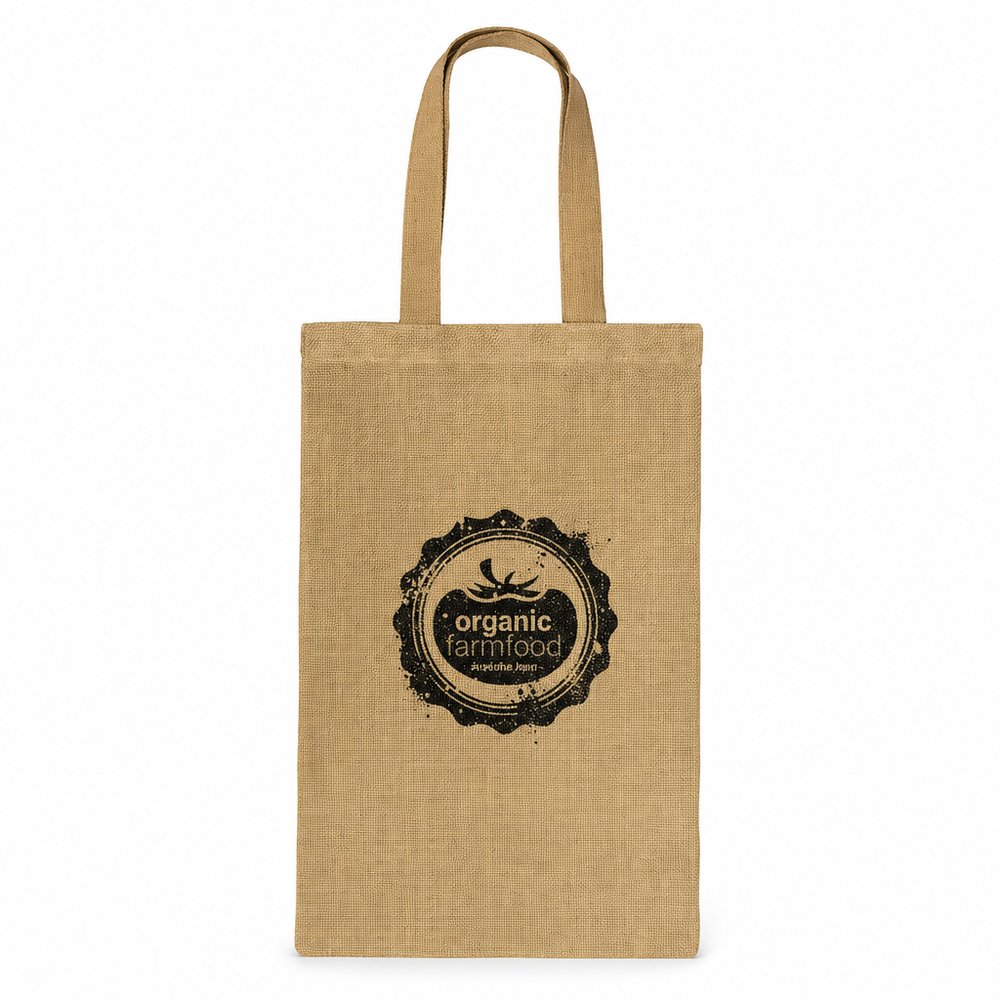
  • Jute Bags (small)
    Jute Bags (small)from US$2.69 ex tax

    Why it carries the move: a jute bag = carrying things forward — the open vessel that says 'take this with you, it has worth' — the rough texture of a small jute bag holds heavy black ink beautifully, turning a basic tote into a walking billboard.

    A weekend market-goer → reaching for it on the door hook every Saturday morning instead of grabbing a fresh plastic one, the brand riding shotgun on their best routine.

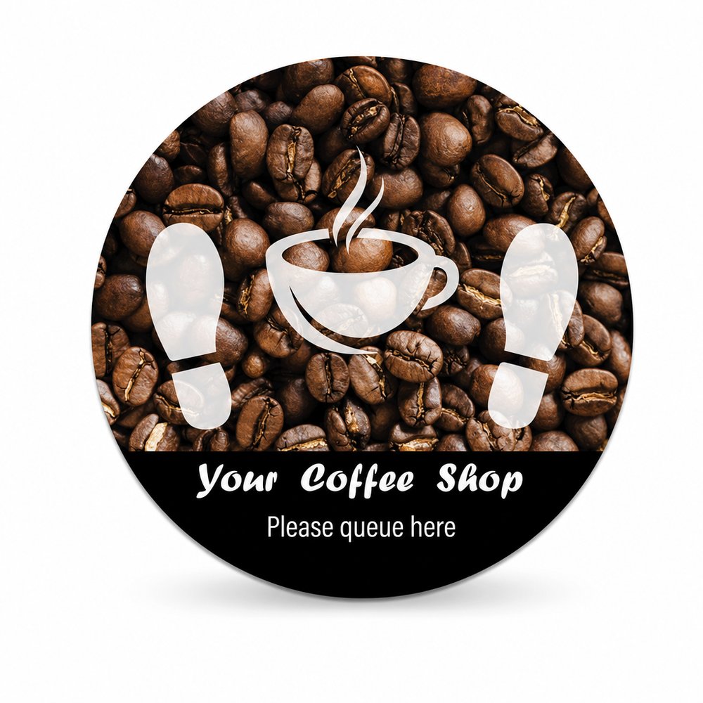
  • Floor Decal Stickers (Various Sizes)
    Floor Decal Stickers (Various Sizes)from US$3.54 ex tax

    Why it carries the move: a floor decal = a directional mark on shared ground — it points, claims space, and says 'this way, you belong here' — scaling a massive, cropped wordmark across a floor decal creates a brutalist entry moment for a physical store.

    A store manager on opening morning → peeling one down and seeing the queue self-organise without a single 'please line up here' sign, the floor doing the work for them.

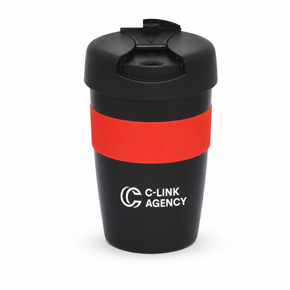
  • Reusable Stainless Steel Double Wall Cups (320ml)
    Reusable Stainless Steel Double Wall Cups (320ml)from US$8.32 ex tax

    Why it carries the move: a held-warm vessel = the daily ritual of pause, the small comfort carried from home into the world — laser engraving a massive wrap-around font on raw stainless steel channels this exact industrial energy.

    A new café regular → the 7:43am pour where the barista grabs THEIR engraved cup off the shelf and the line behind them notices.

Three more from the studio

More moments worth a look.

Want something like these?

Ask Findie for a quick conversation, or hand the brief to Susan and the team. Either works.