Brand crush
versedvisual
Identity by versedvisual
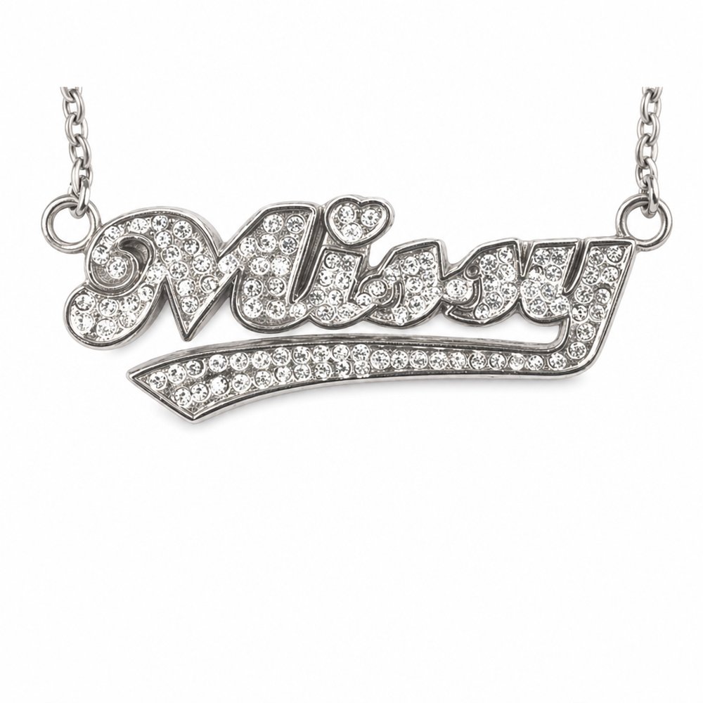
tactile-typographytactile coastal resort, raw linen and silver
The texture of the raw linen completely grounds those tiny metallic beads, creating typography that catches the light and casts a physical shadow. By rendering the wordmark as a 3D, tactile object rather than a flat print, the branding demands a second look.
The portable idea
I am looking at how those little silver spheres cast real shadows on the fabric weave, turning a standard font into a piece of jewellery. If we swap a standard flat print for a raised or textured application on a natural material, the logo stops being a graphic and becomes a tactile feature. It gives people a reason to run their fingers over the brand name.
May 26, 2026Brand study